AWARD-WINNING “MID-CENTURY HOUSE MEETS 21ST CENTURY”
Built: 1956
Contractor: Jensen Hus
Photographer: Michael P. Lefebvre
Scroll down to see each phase of the project: Define, Design, Deliver.
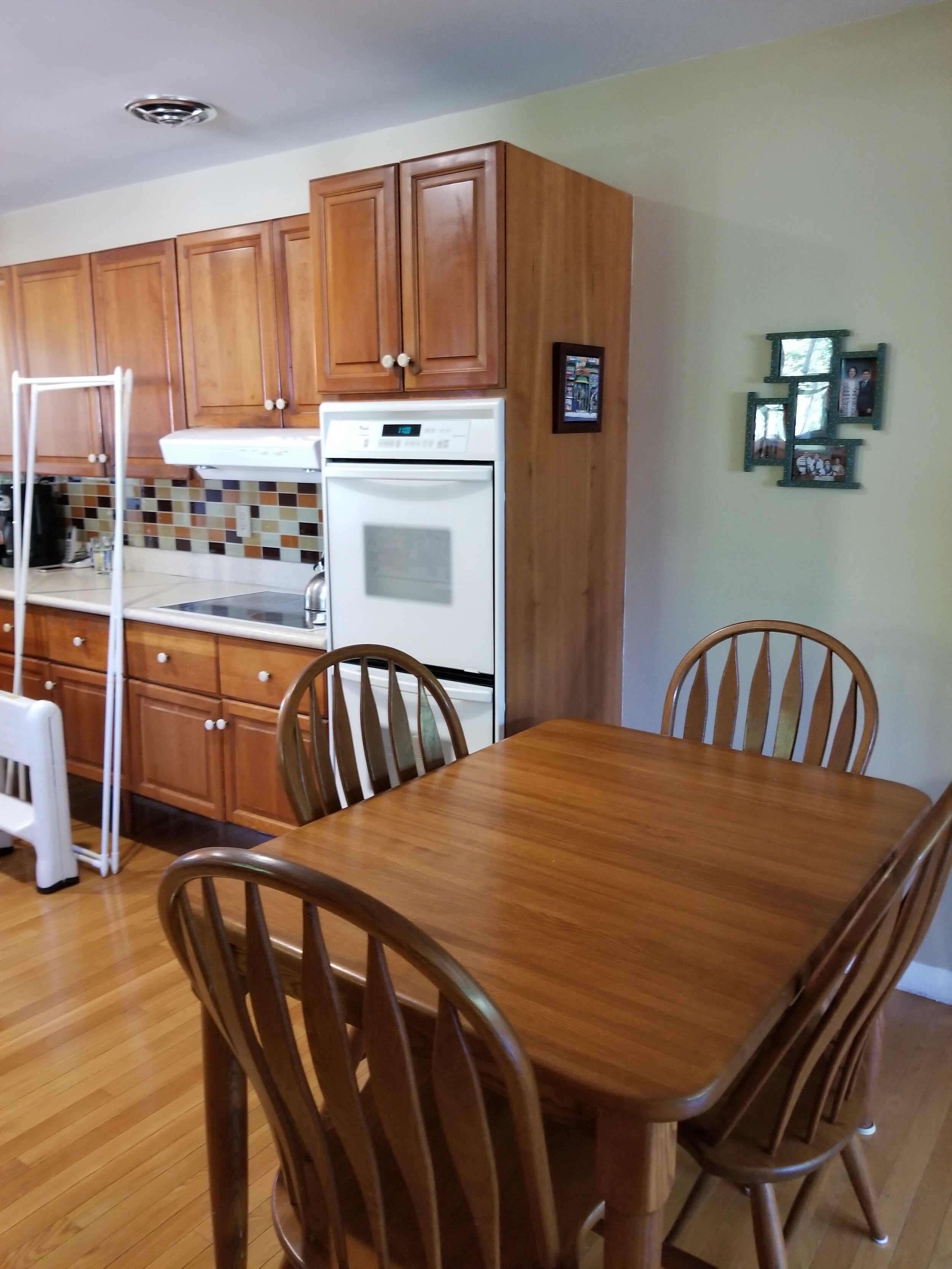
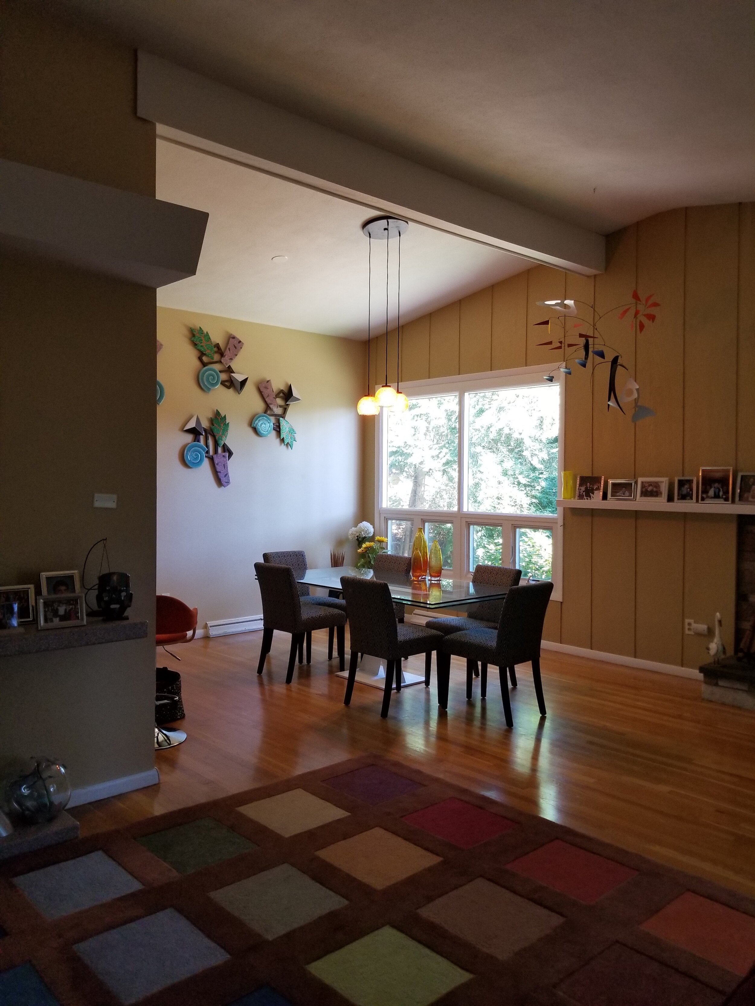
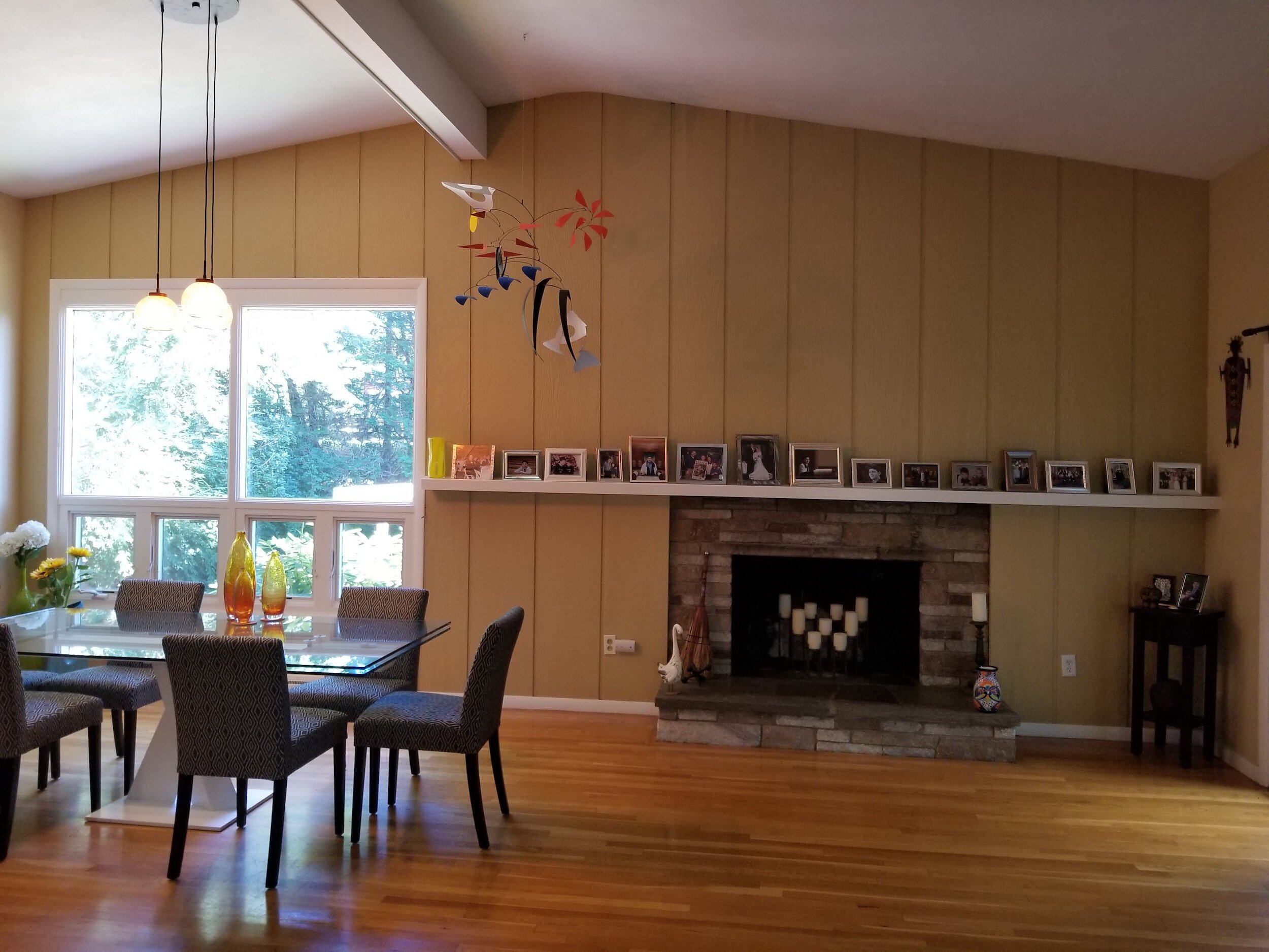
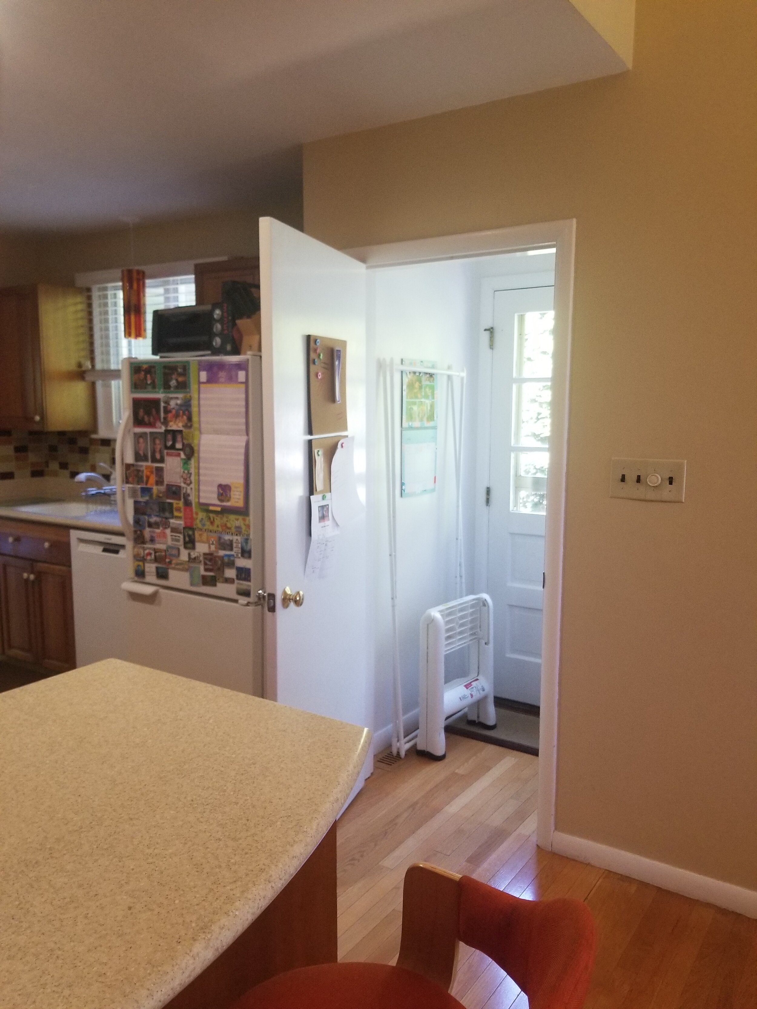
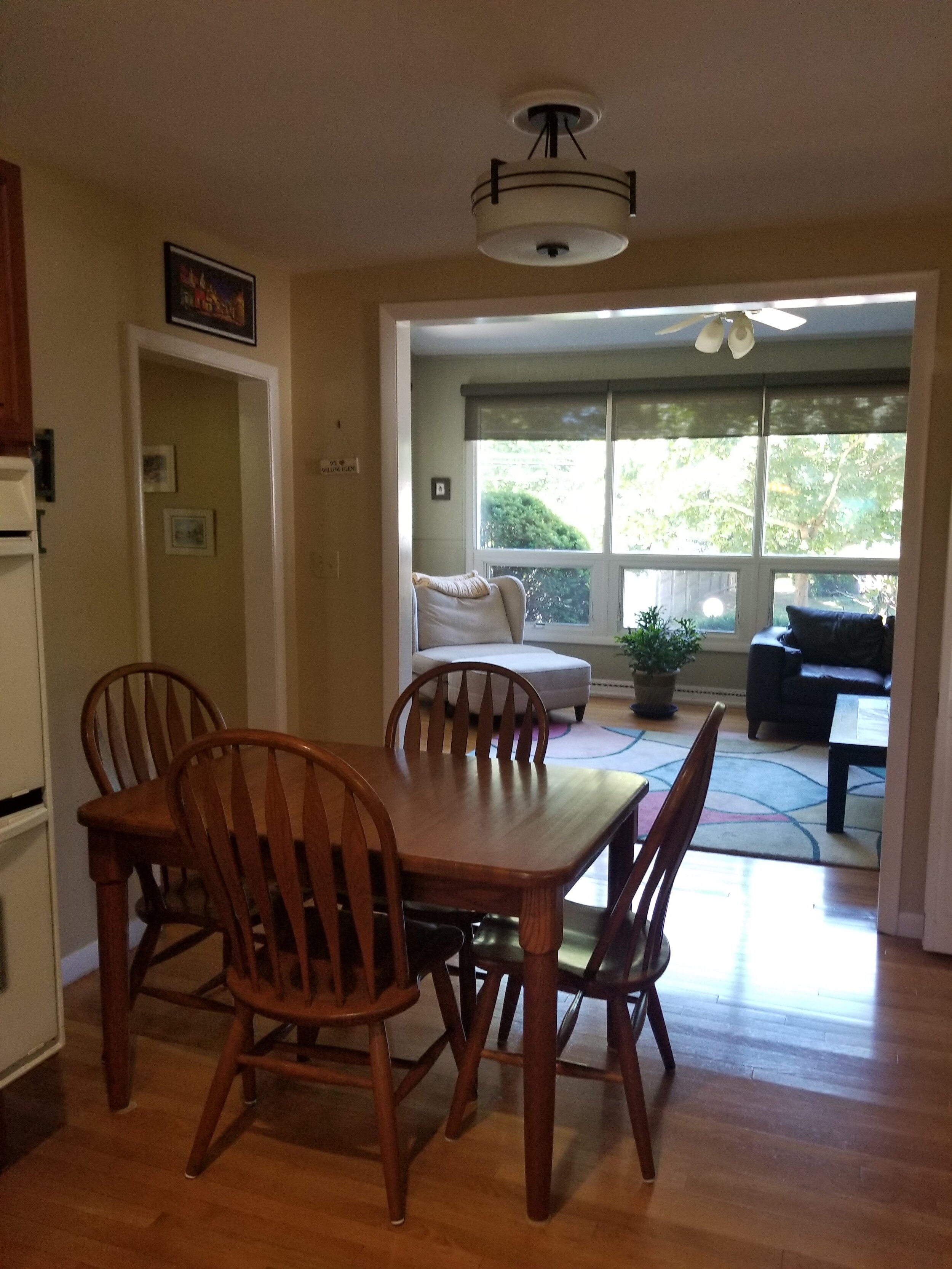
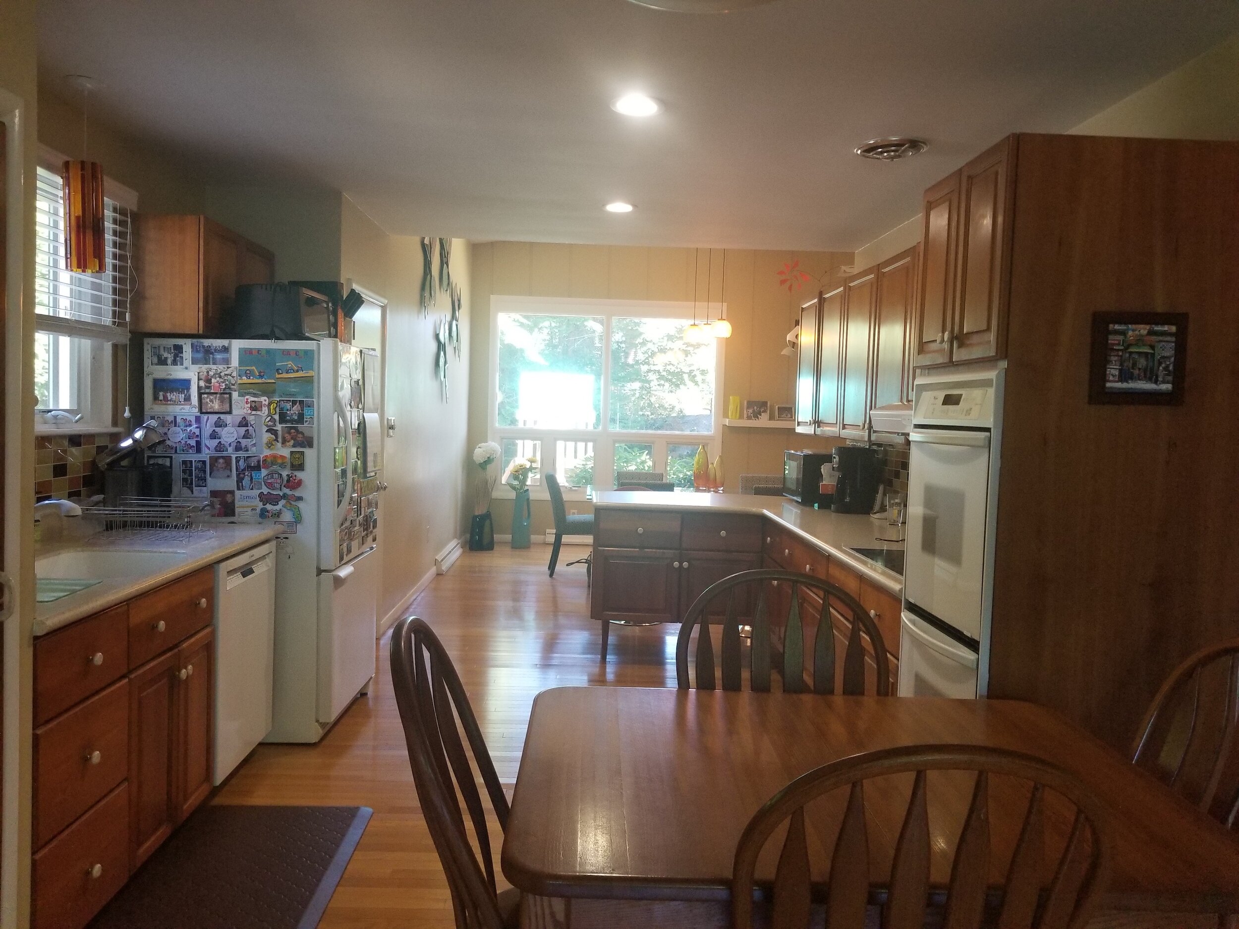


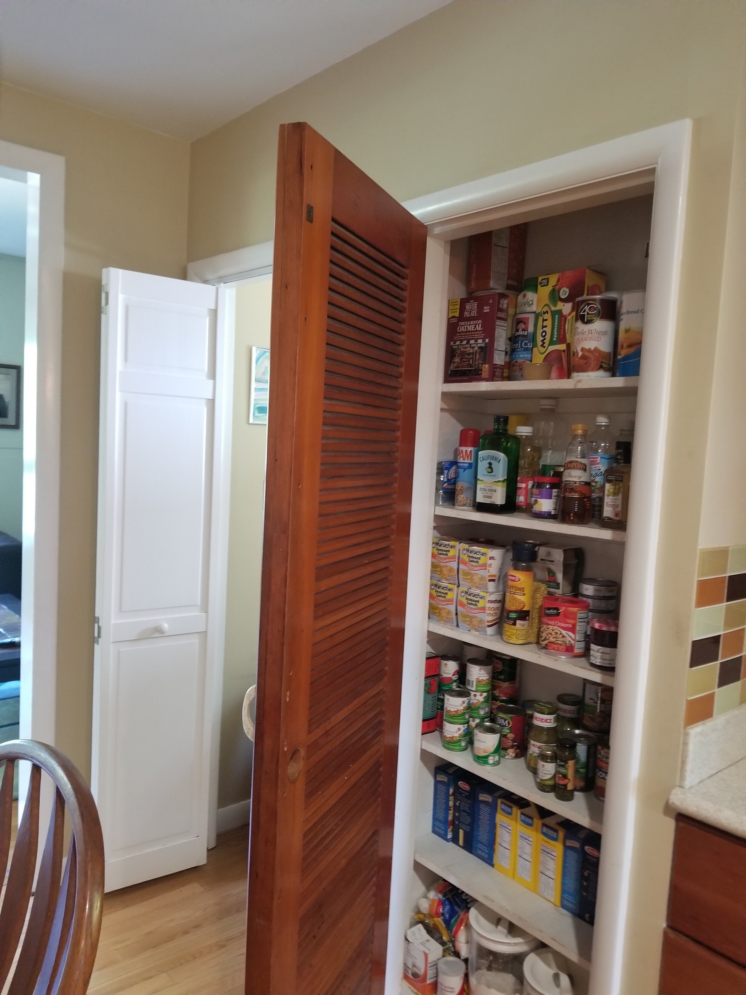
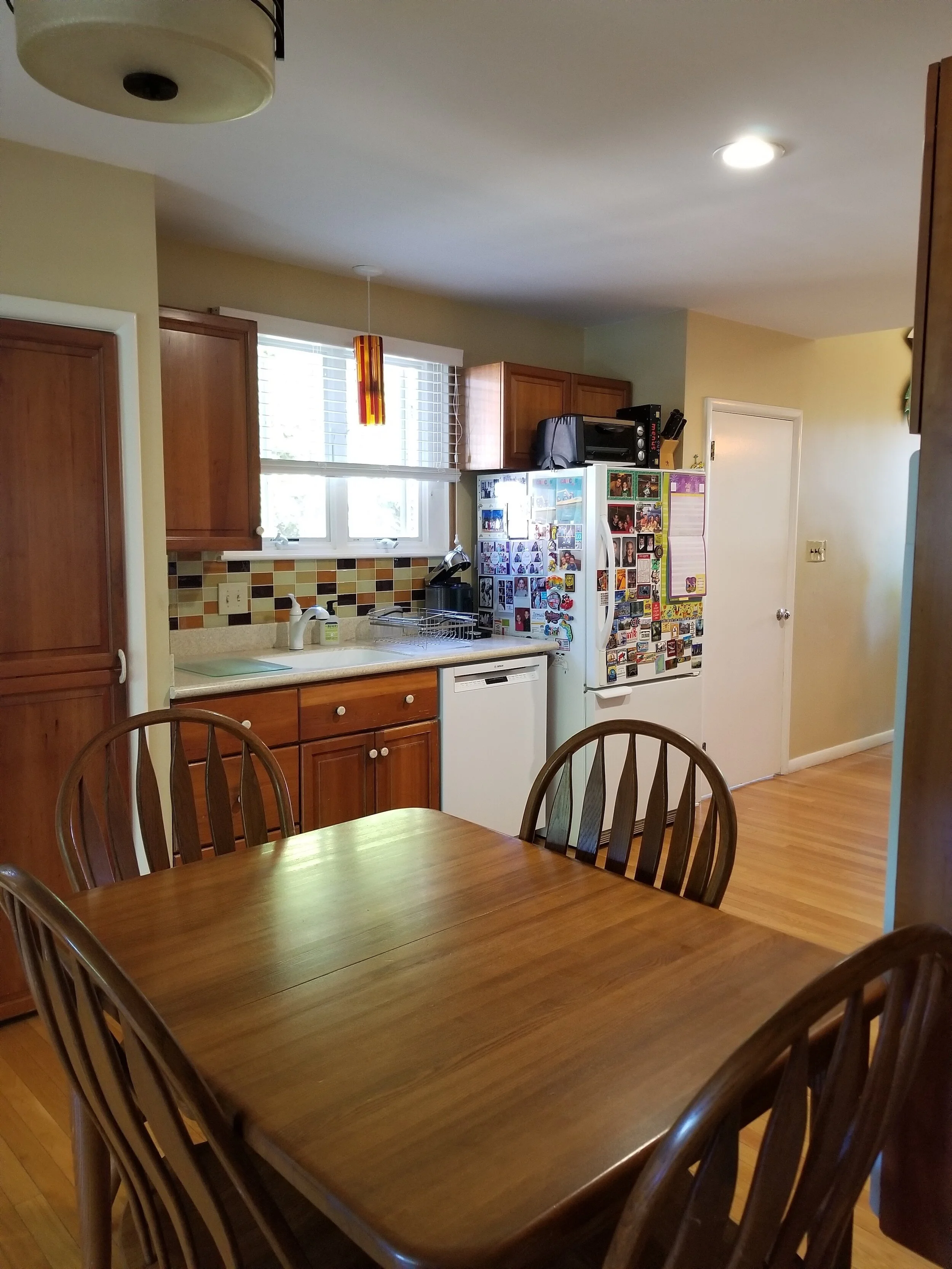
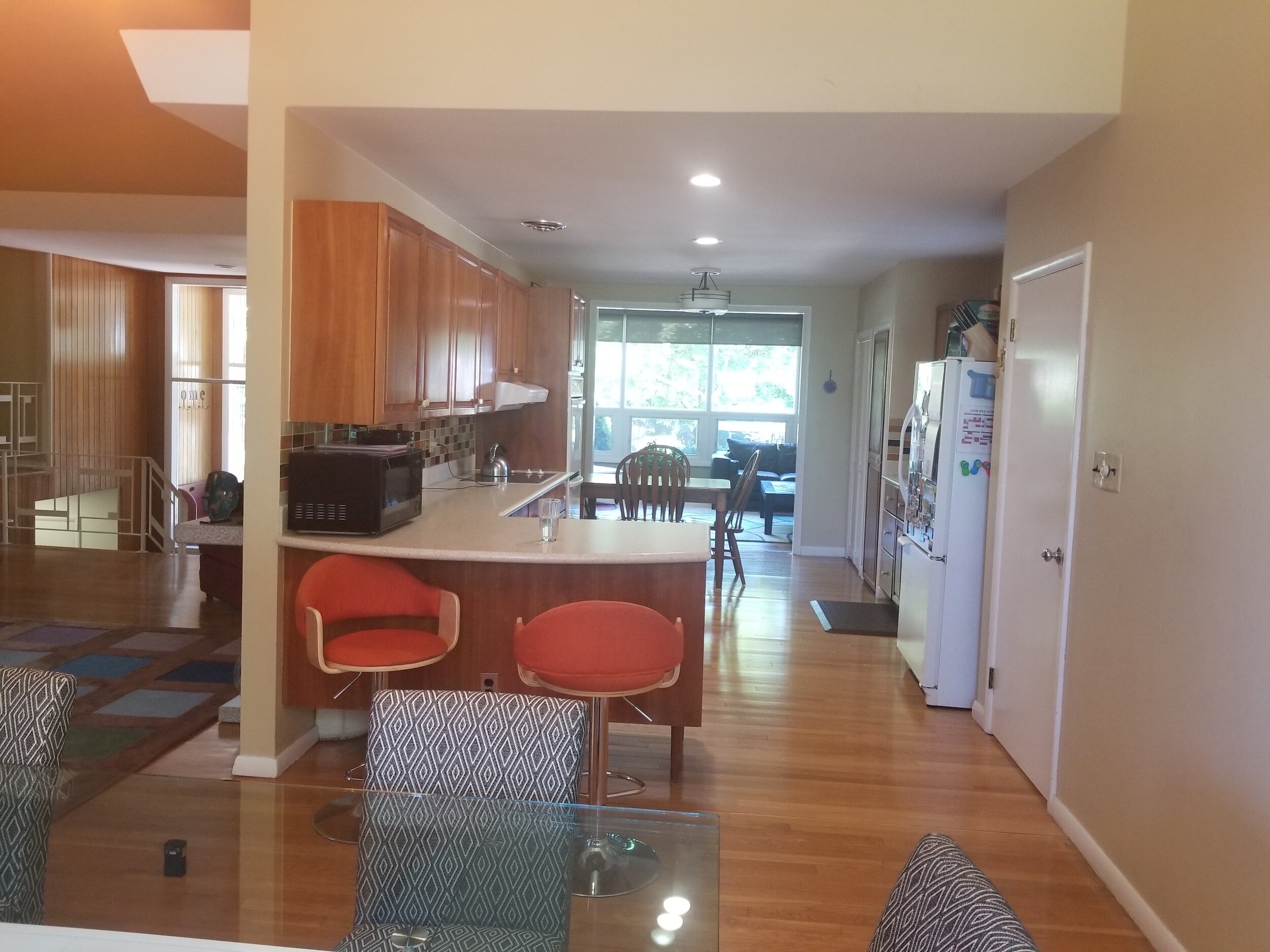
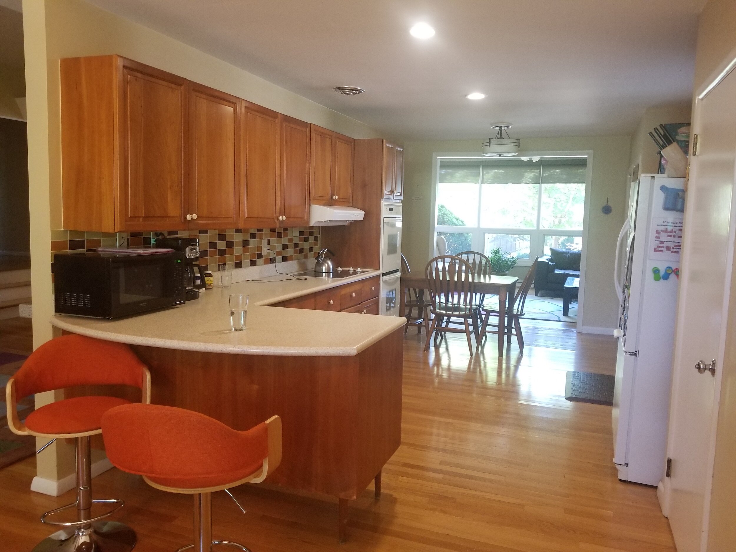
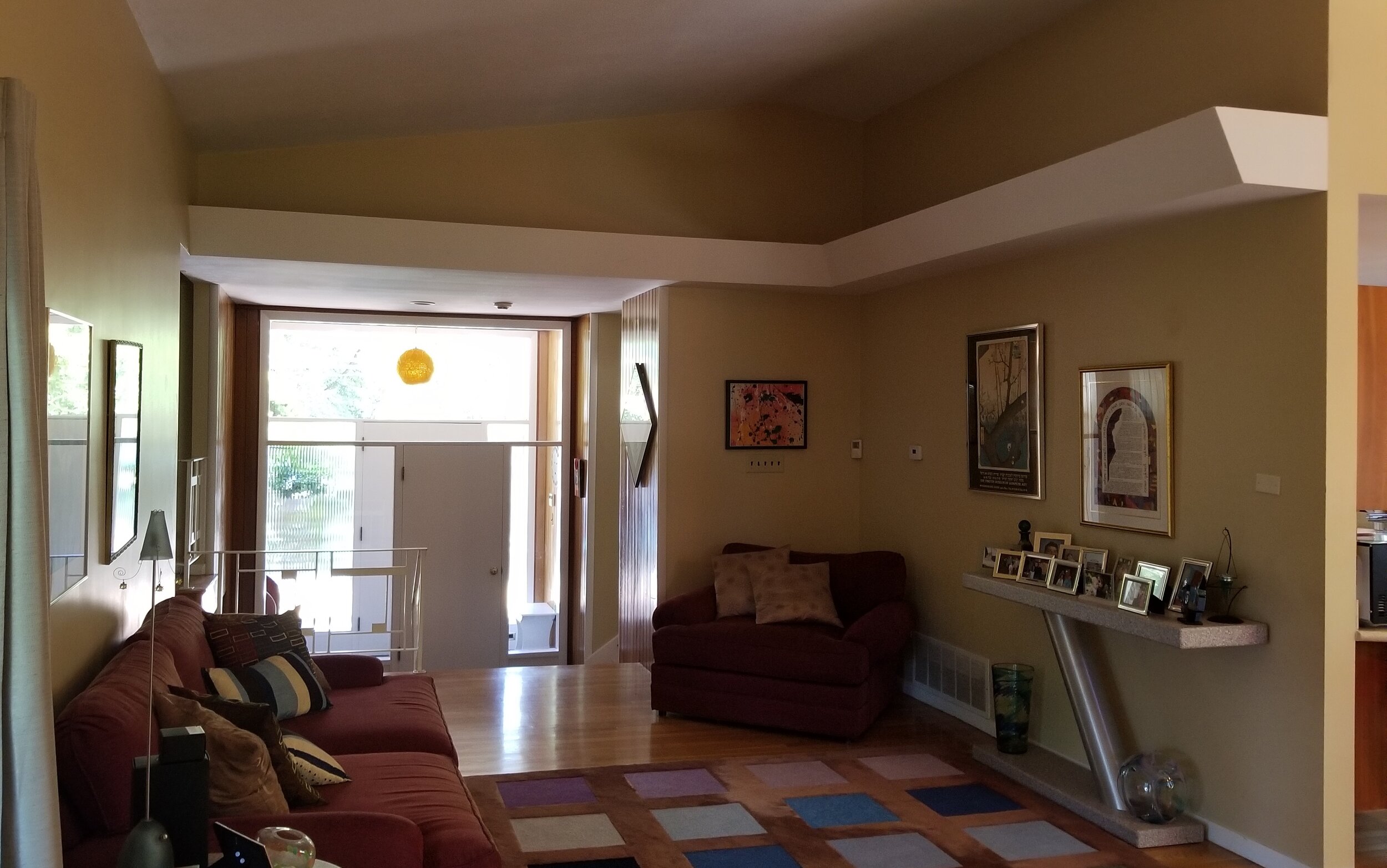
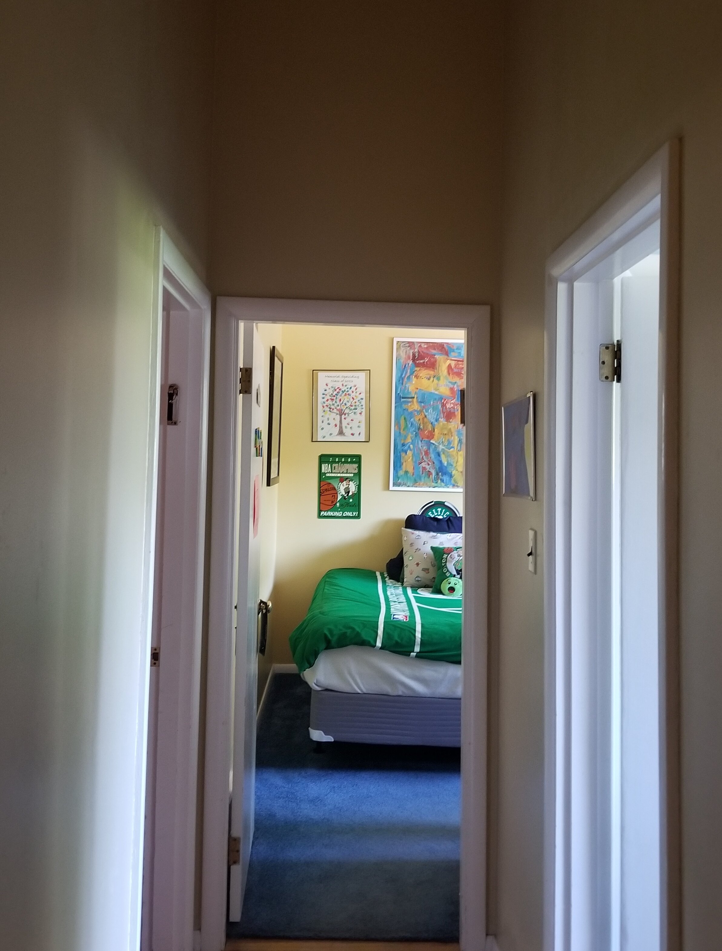
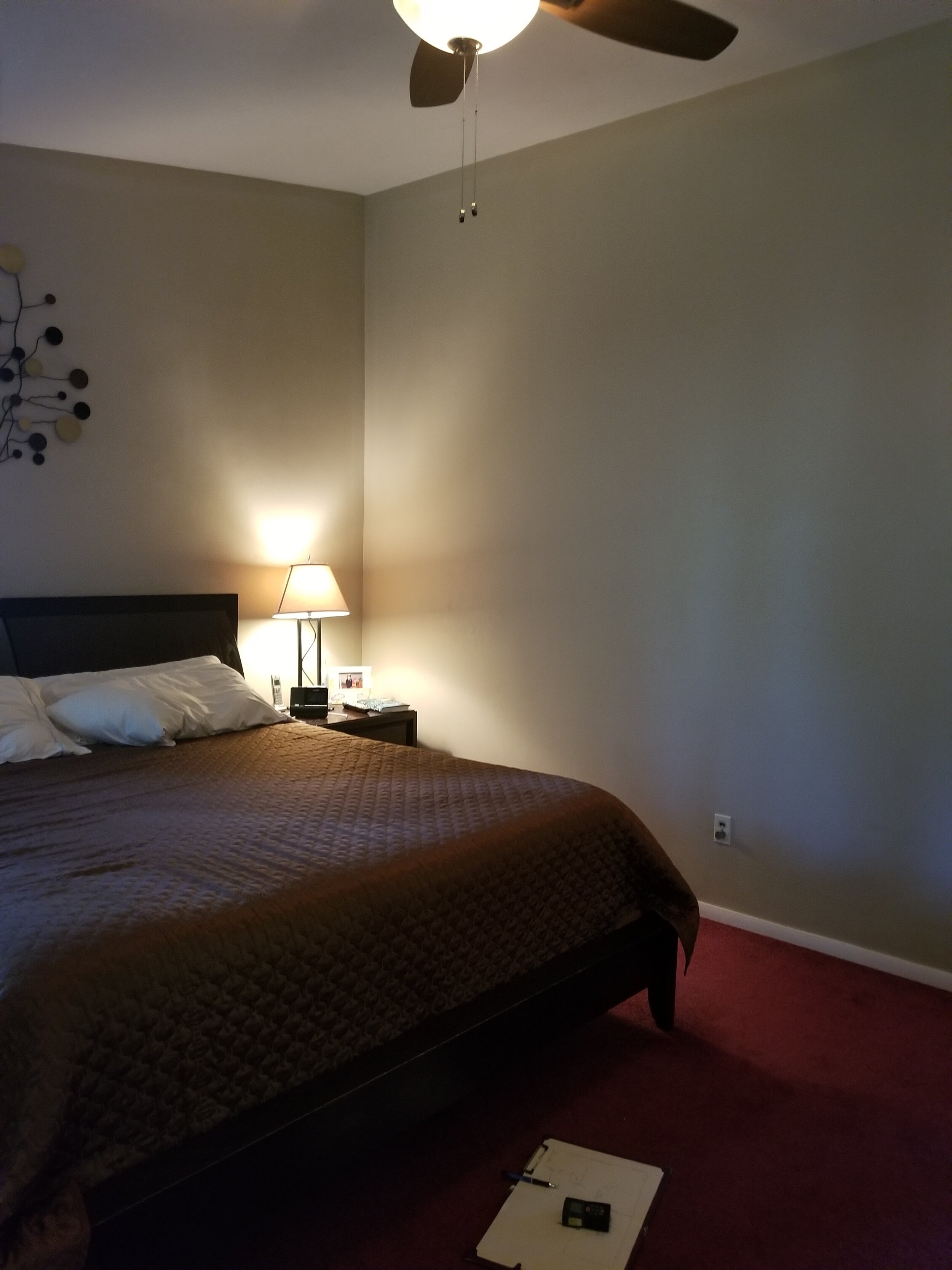
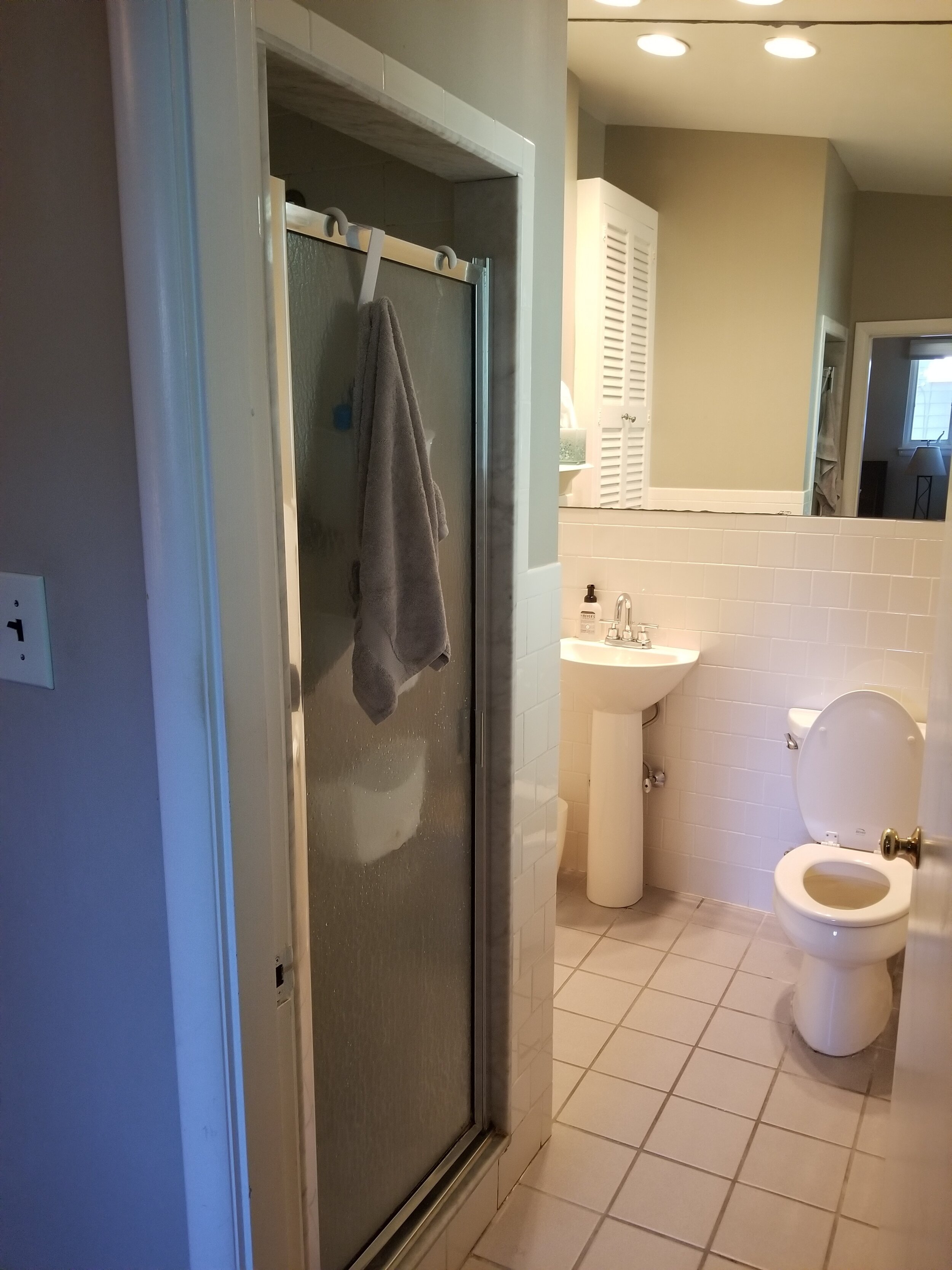
The first floor of this mid-century split-level home in Newton wasn’t efficient at all, so the homeowners contacted KitchenVisions for an update. The clients loved to entertain and wanted to optimize the space to host family and friends. They also appreciated the mid-century modern vibe of the home and wanted to preserve some aspects of it while updating it for the 21st century.
In the original kitchen they had a small pantry and a rarely used side-entrance. Their dining room table occupied space at the rear of the kitchen, but they also had a table awkwardly placed at the other end near the family room. The refrigerator was on the same wall as the sink and dishwasher, but these were not well-defined prep, cooking and clean-up zones. A small, built-in pantry squeezed the countertop space even more.
The living room was mostly unused, containing an unattractive fireplace and vinyl paneling. Off the kitchen, the laundry had a bulky exterior exhaust that needed to be addressed as well.
There was a side entrance with a little hallway that was also mostly unused.
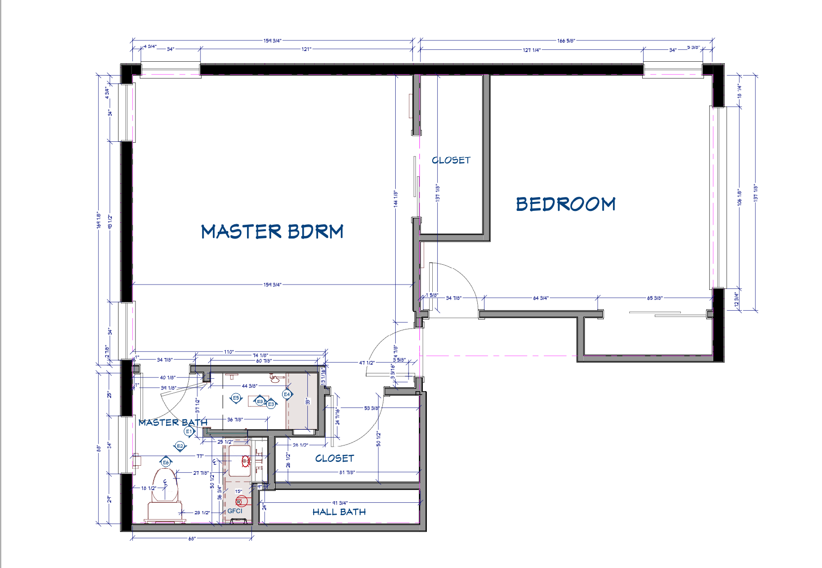
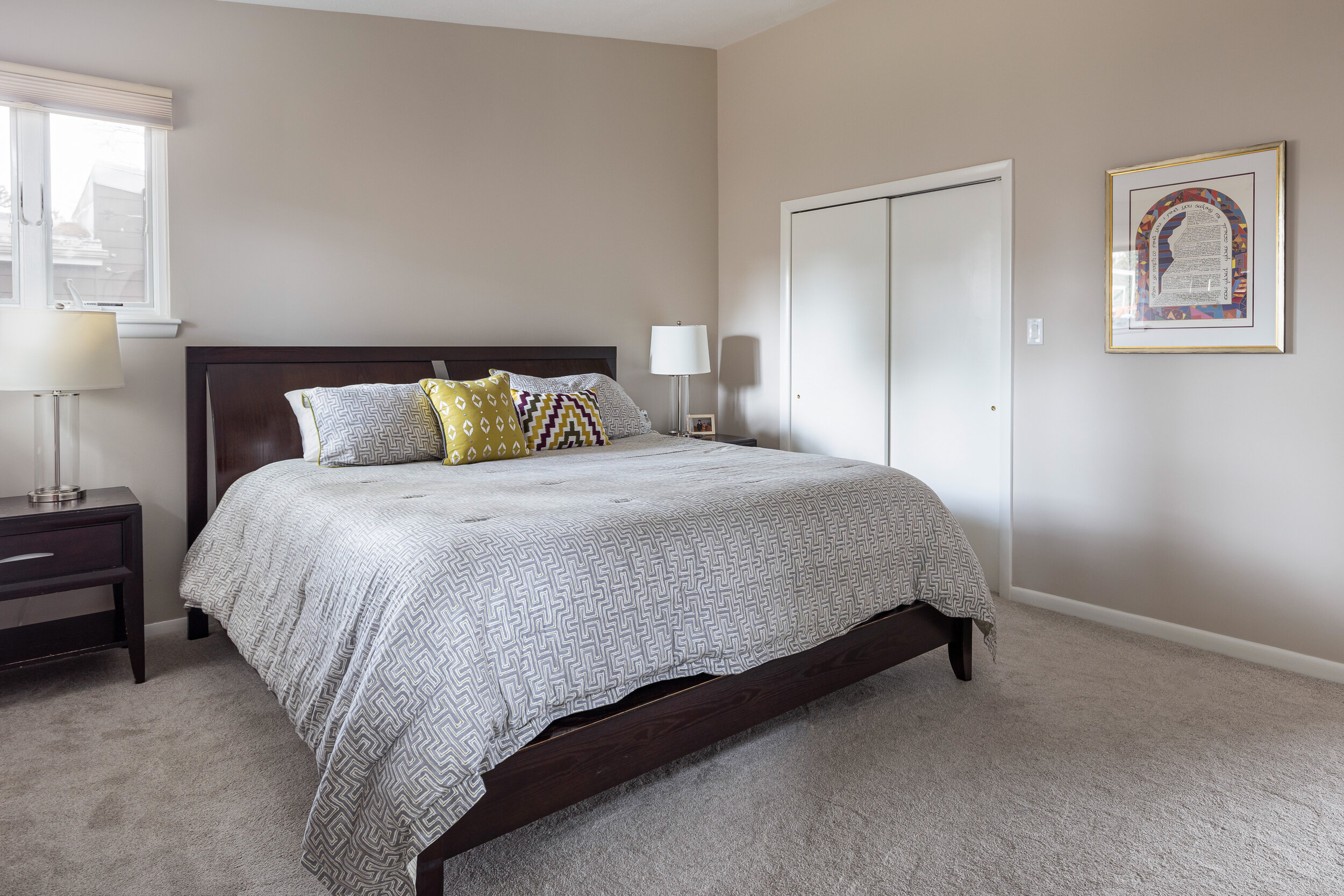
In the master bedroom, the homeowners requested additional closet space and a renovated master bath with a walk-in shower. Prior to the design and renovation, the husband and wife shared one closet.
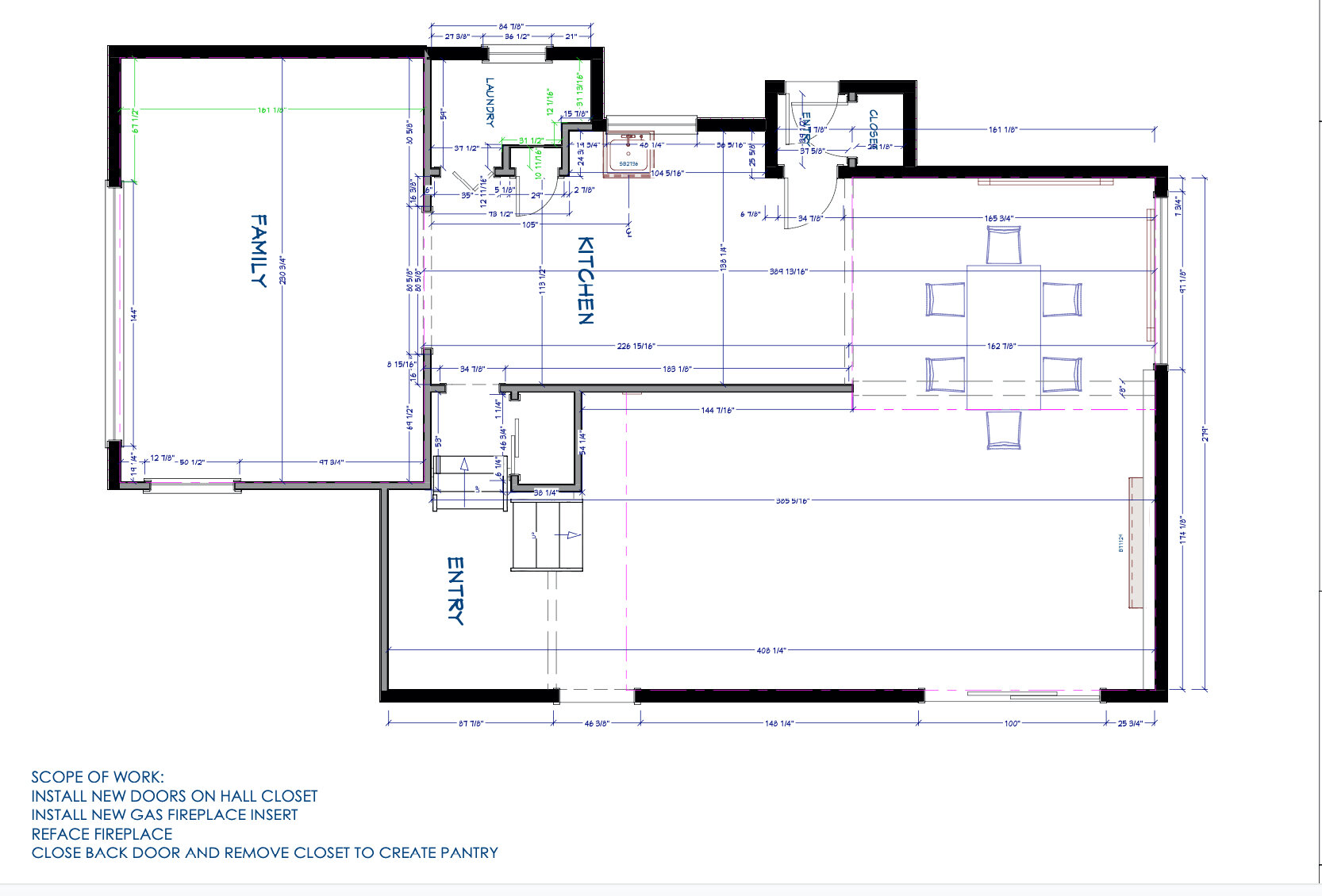
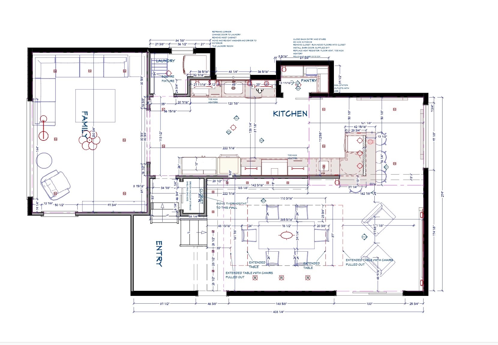
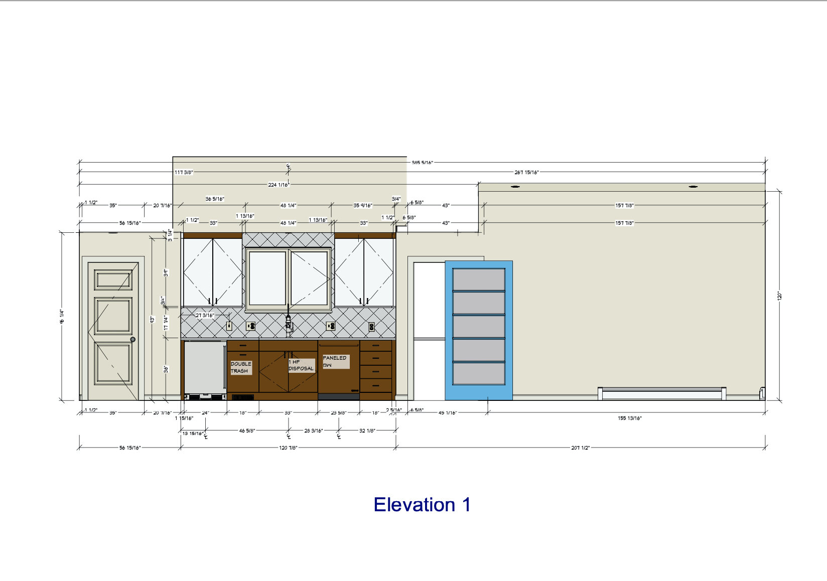
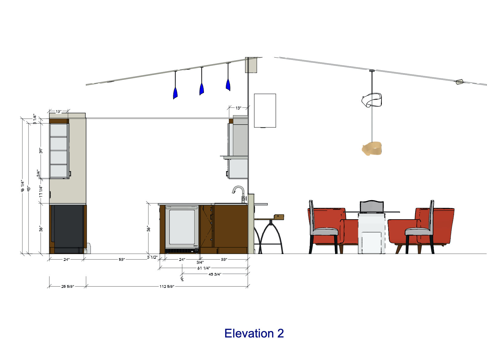
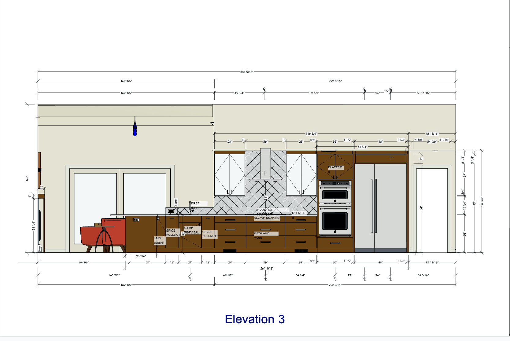

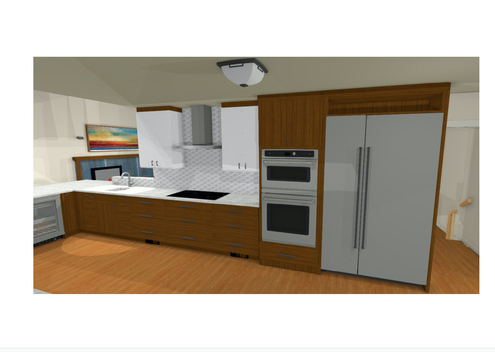
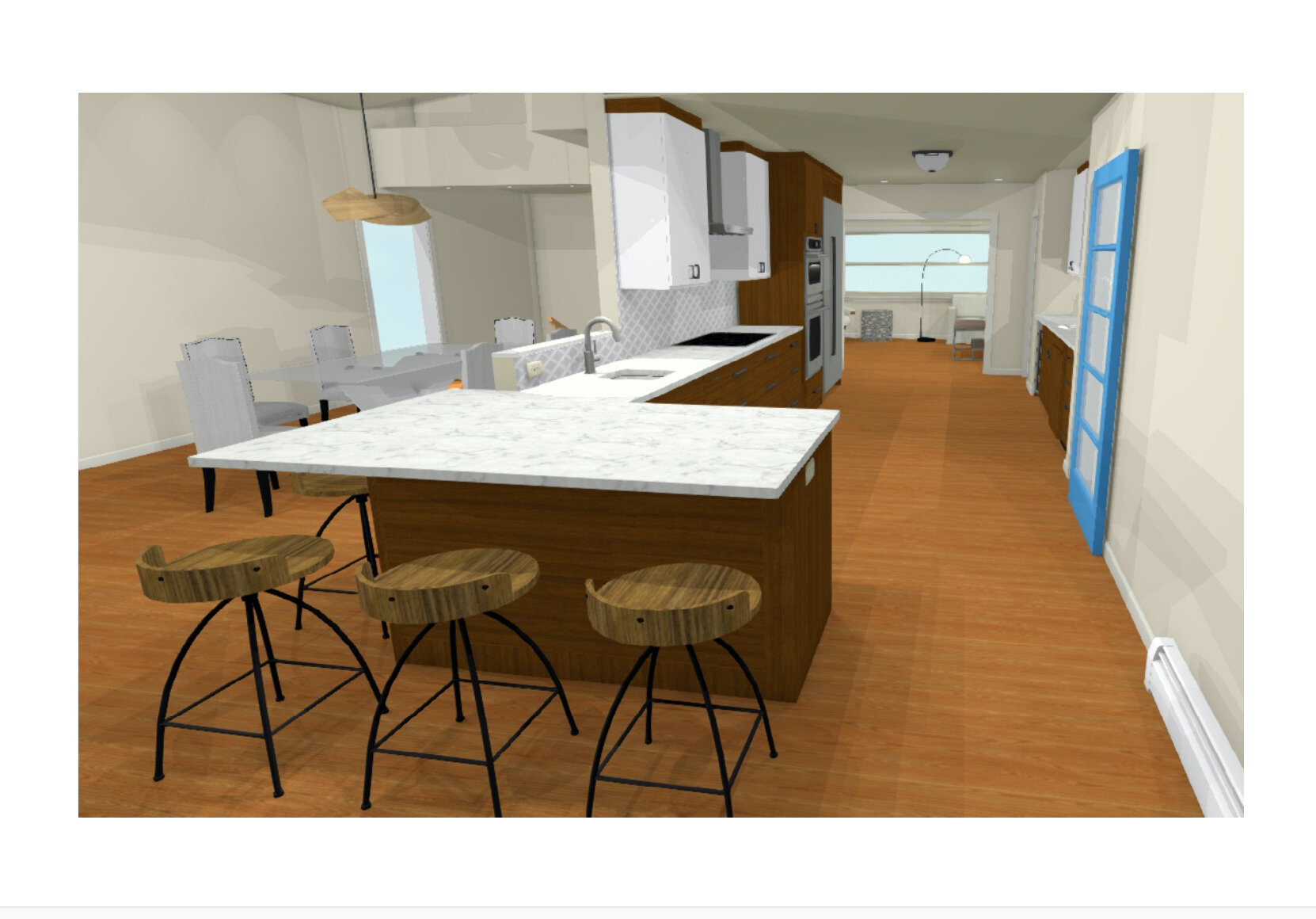

The kitchen design was within the same footprint. Because the space was long and narrow, there was no clearance for an island. We designed a large peninsula at the end of the appliance wall for casual eating. By moving the Roche Bobois glass dining table, with built-in leaves, into the mostly unused living room – that space became perfect for larger family and friend gatherings.
The enlarged peninsula provides seating on two sides and counter space at the L junction with a second prep sink. Beneath the counter is a beverage refrigerator which sets up the peninsula as a buffet or bar for entertaining and taking out the small kitchen table, we were able to add 48” of refrigeration, cooktop and wall ovens, all by Miele, another sink, creating prep and cooking zones.
By expanding the appliance wall to 10 feet in length, we were able to move the refrigerator to the cooktop and oven wall.
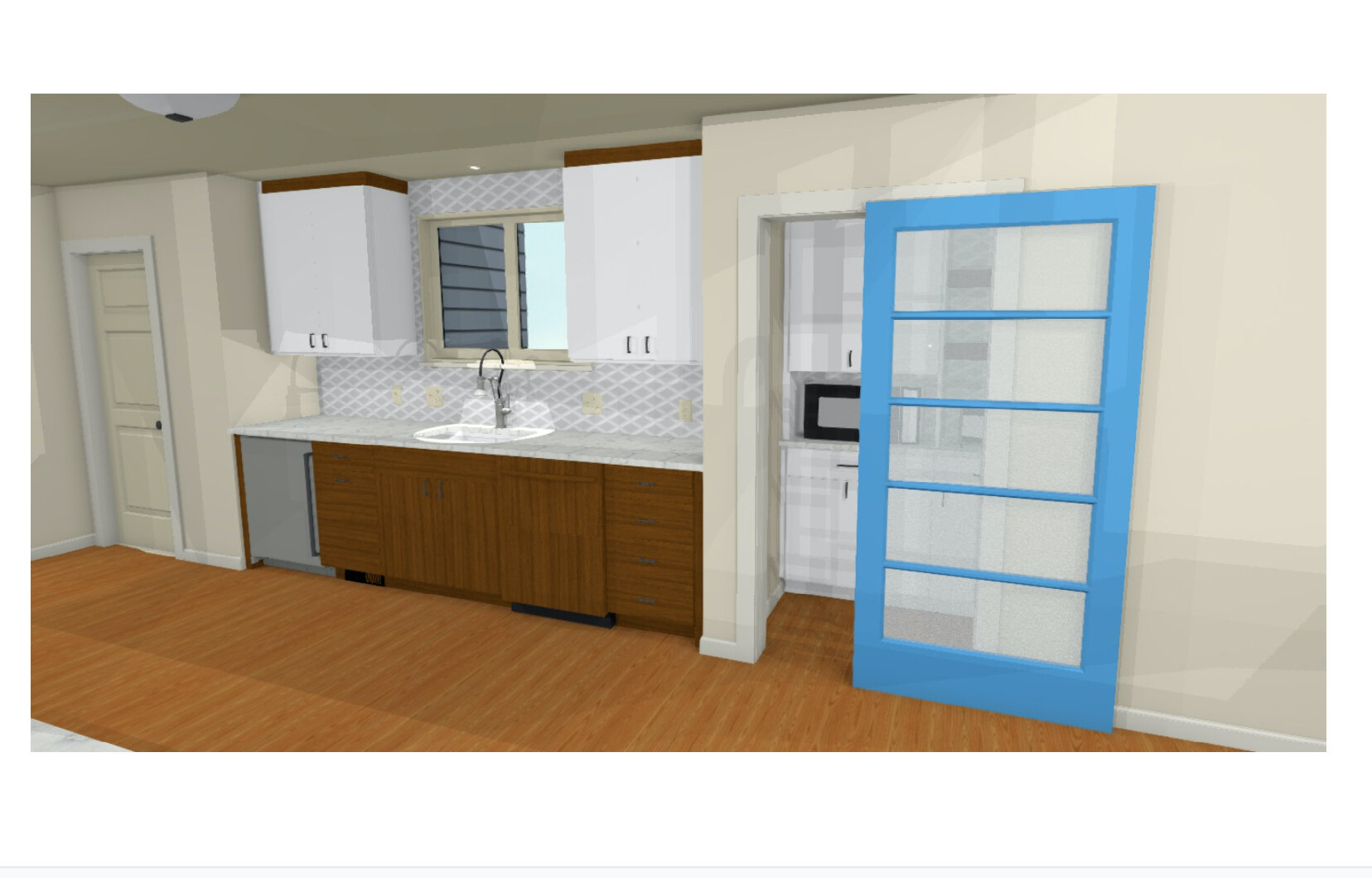
On the opposite wall is the main stainless-steel sink and dishwasher which creates a clear clean-up zone.
Countertops are Silestone Eternal Calcatta Gold quartz. The dimensional tile is from Anatolia, Soho Convex Loft in white high gloss. Cabinets are from Cabico, Faucets are from Brizo. Hardware is from Top Knobs.
We proposed removing a coat closet and an exit to the unused side of the house to become the new walk-in pantry. By removing the side entry and hallway, we gained space for a walk-in pantry. The new walk-in pantry provides plenty of storage, room for staples, a microwave and a coffee station. The blue and frosted glass sliding door is a focal point for the kitchen and creates visual interest, marrying the blue large format tile of the fireplace.
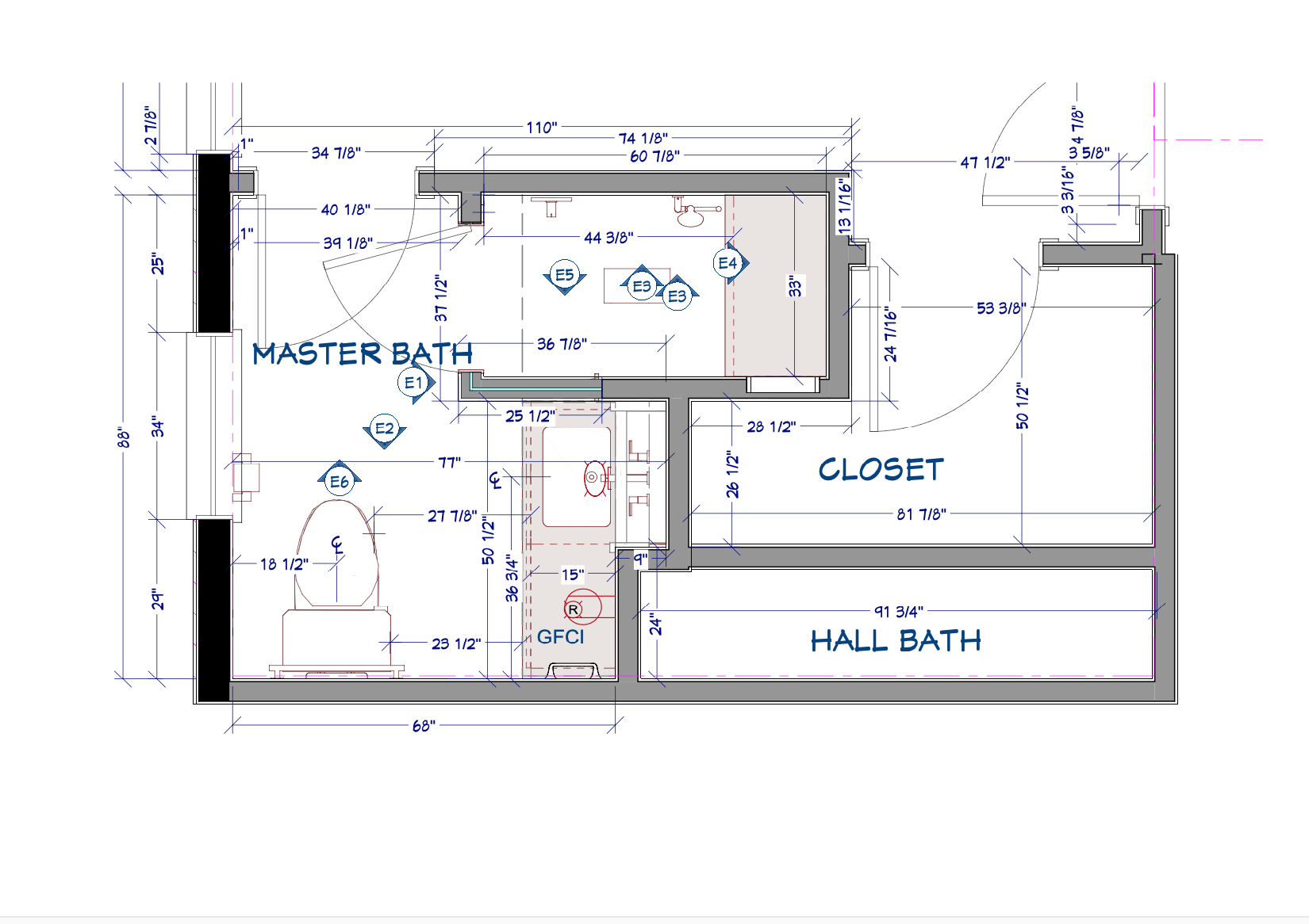
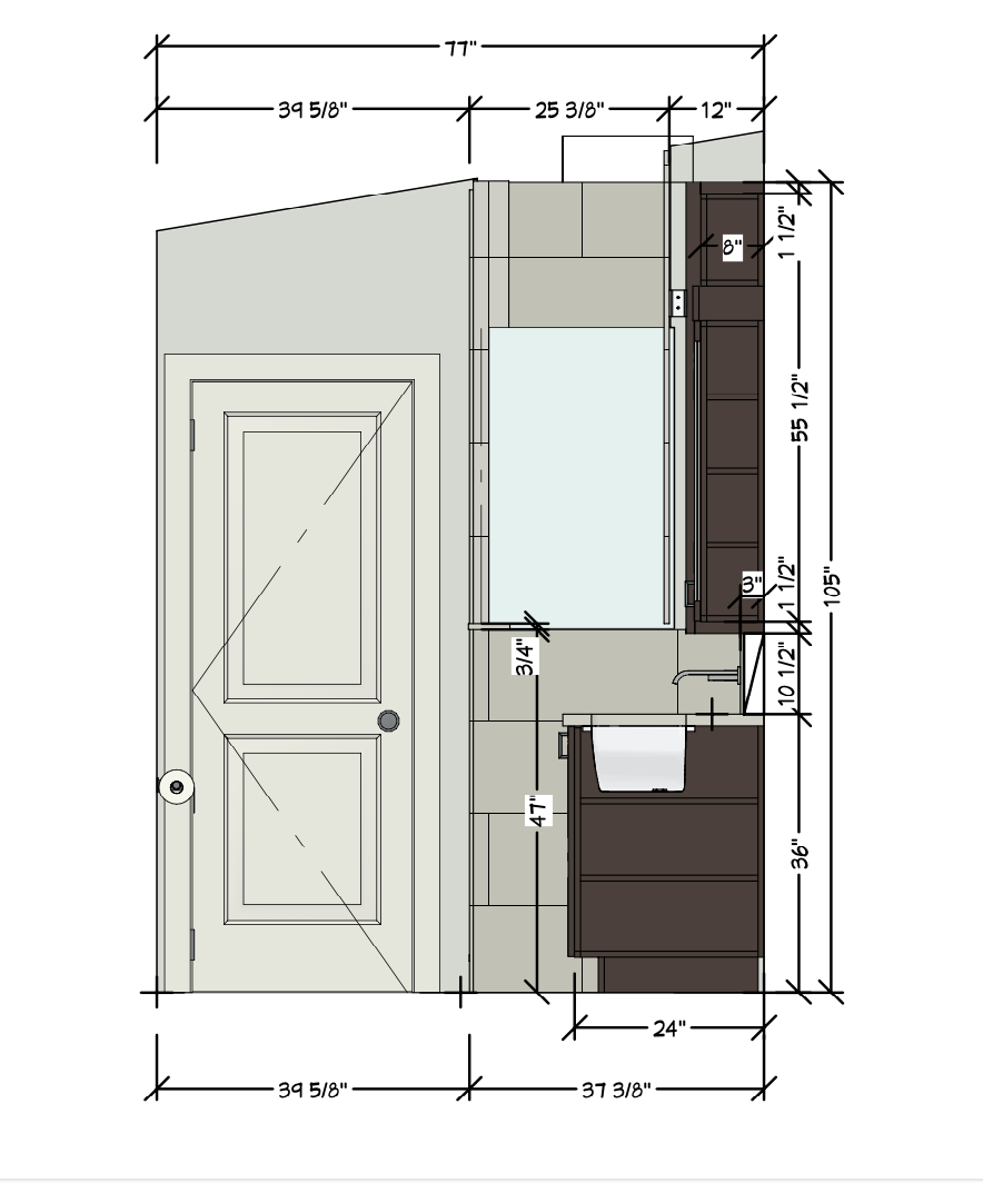
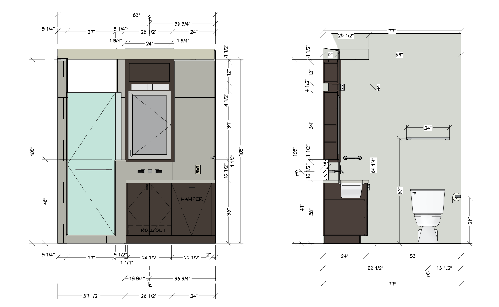
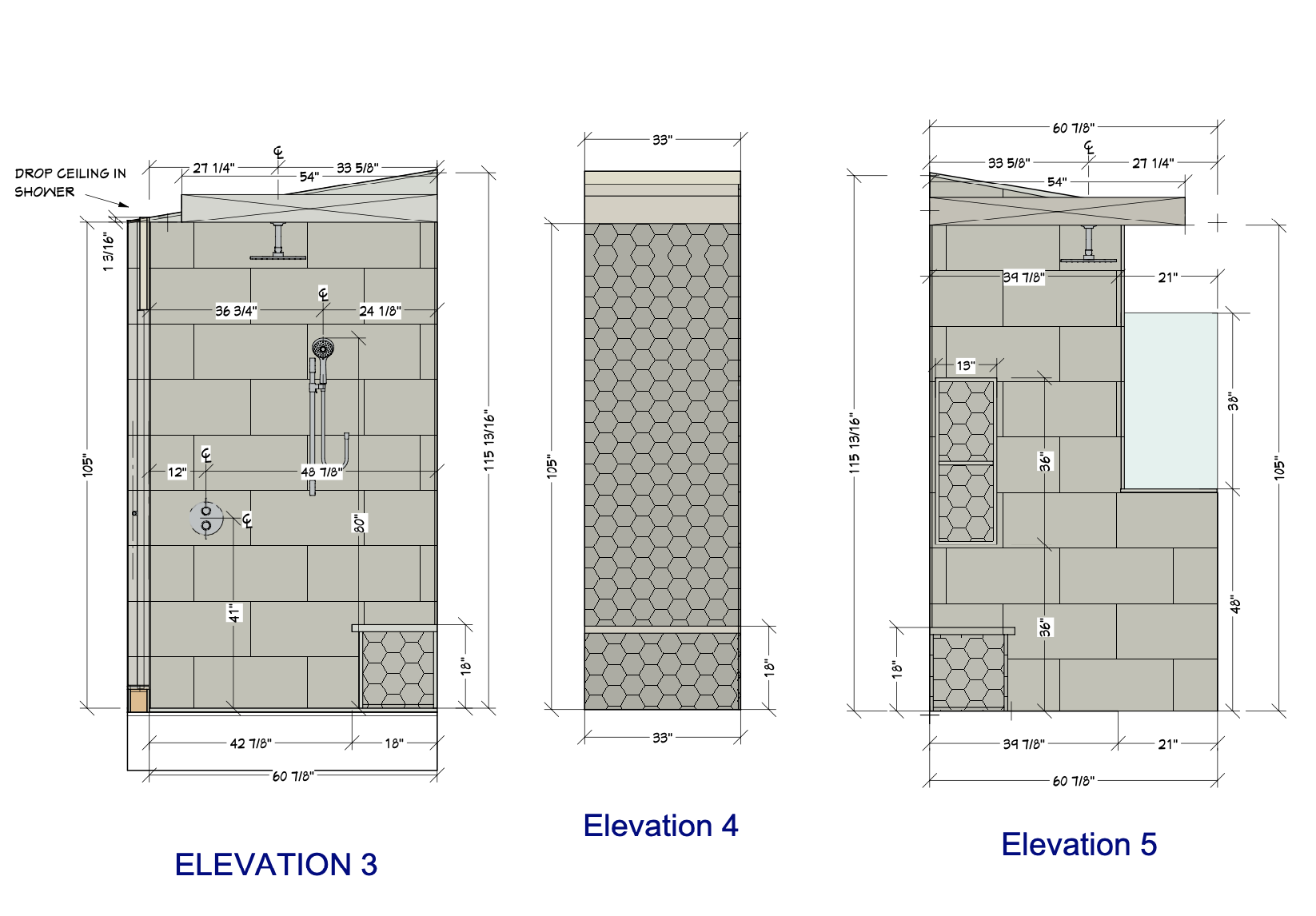
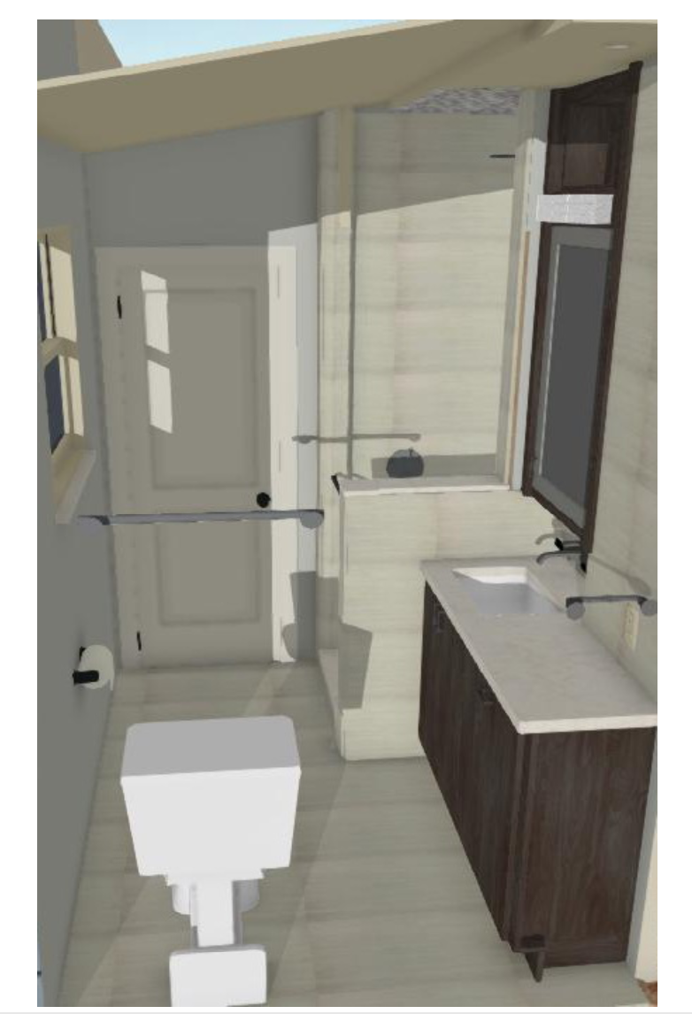
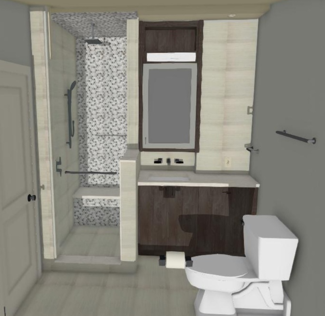
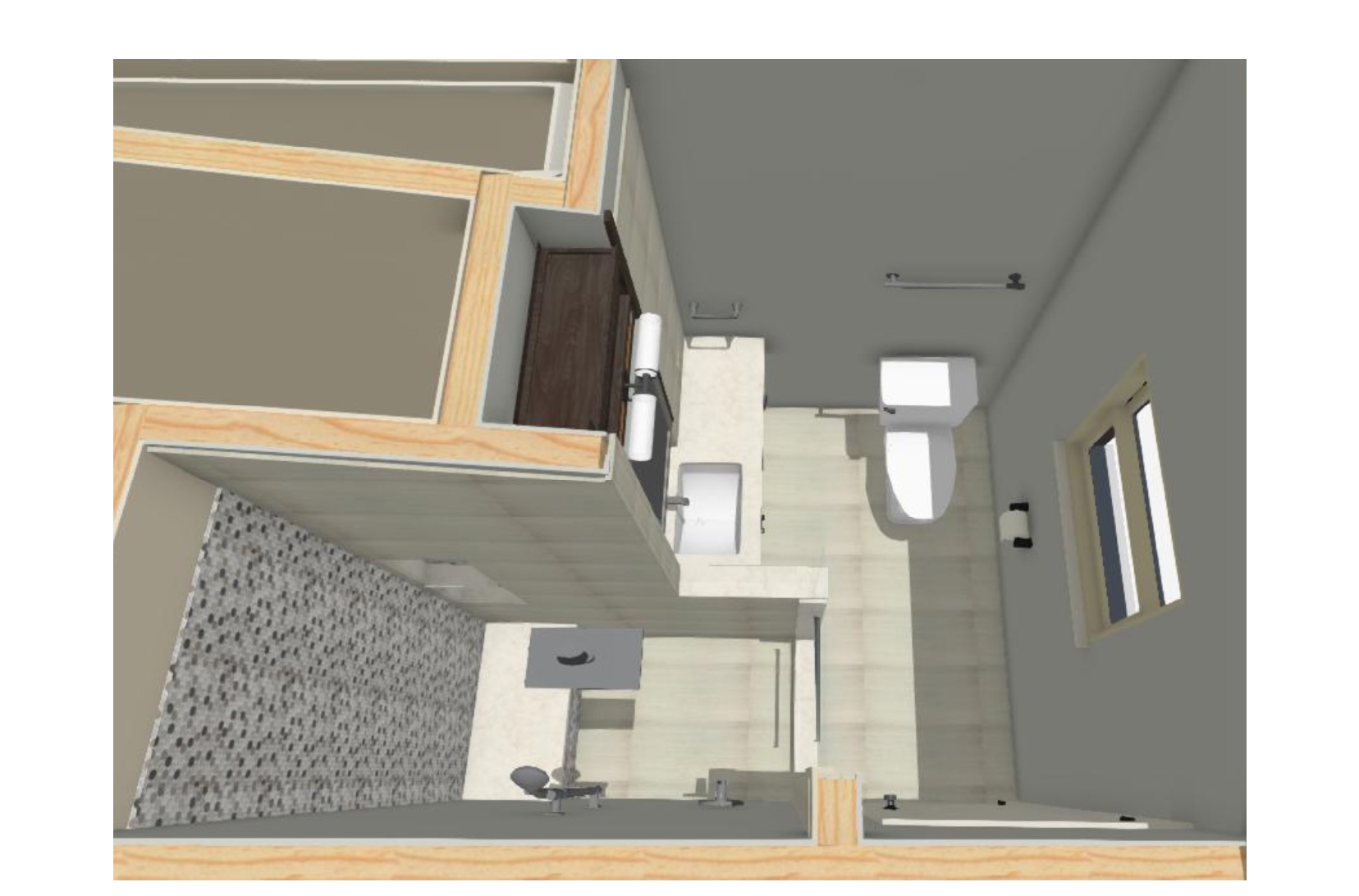
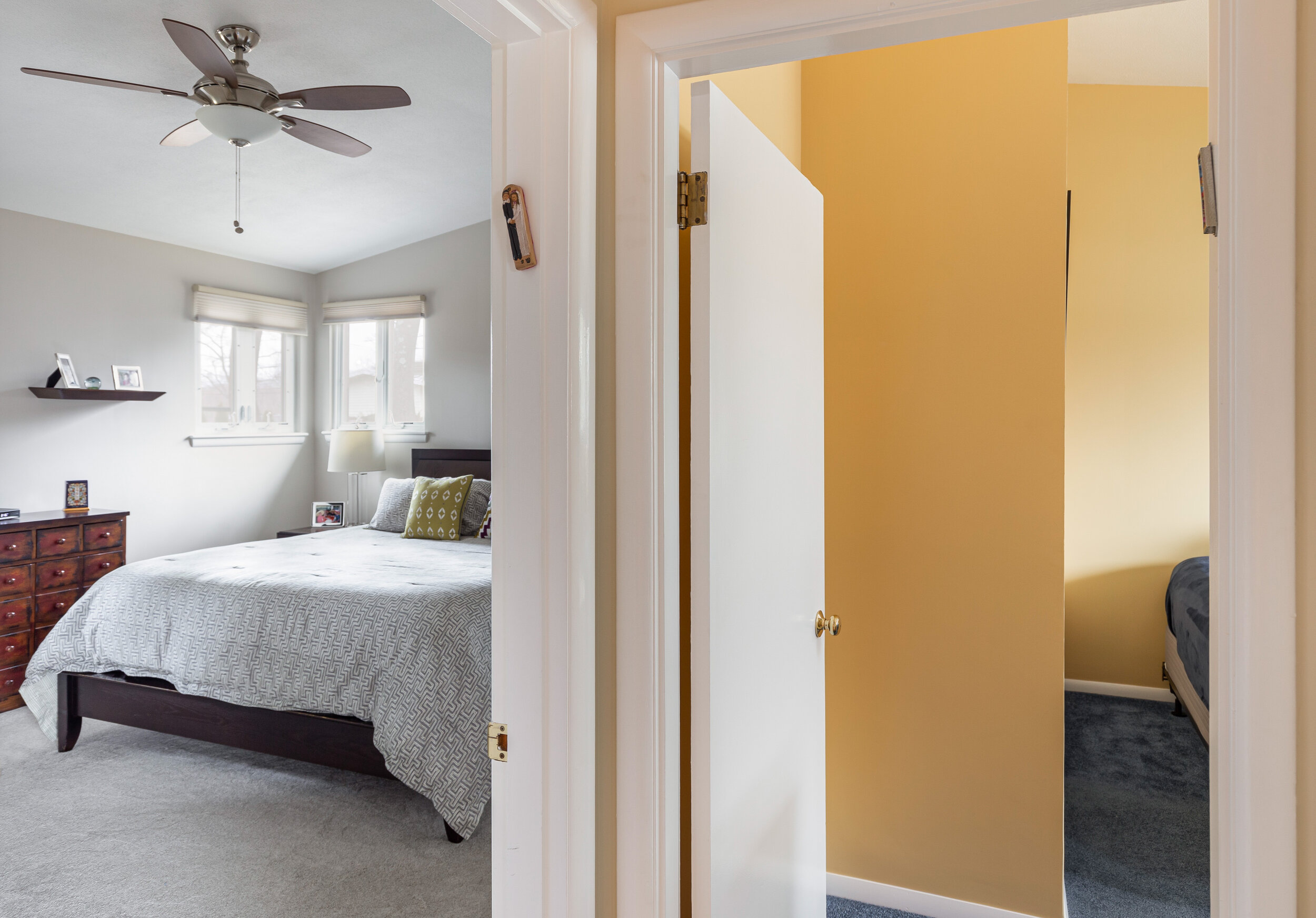
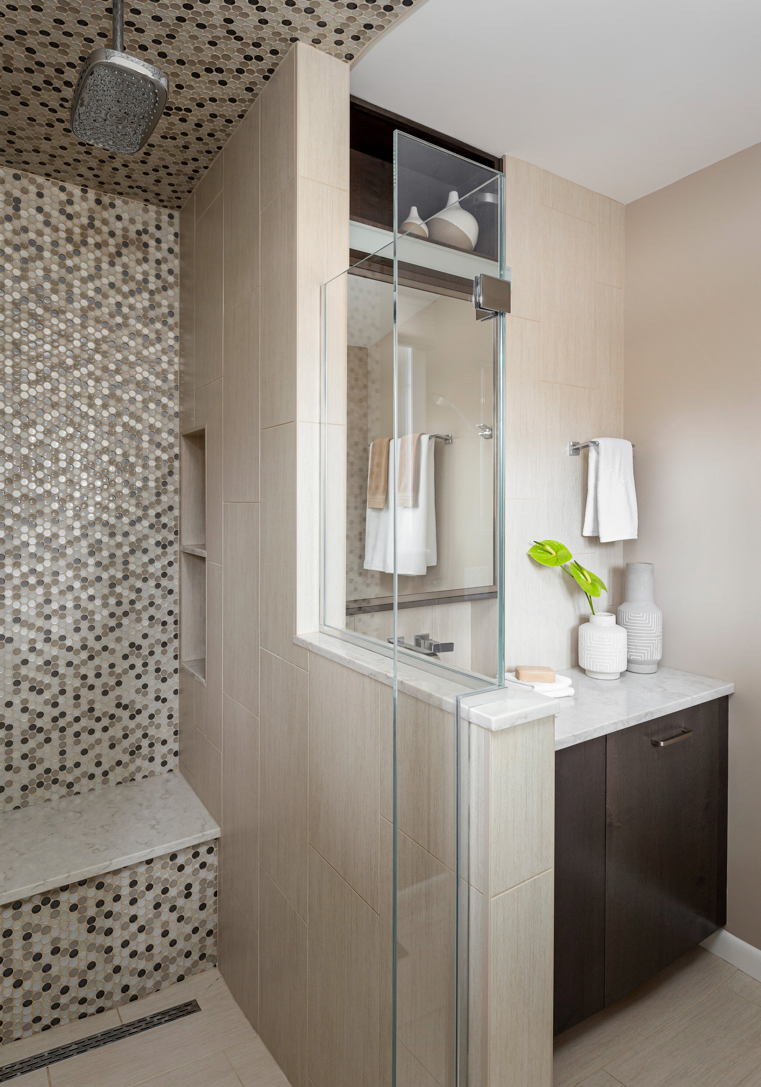
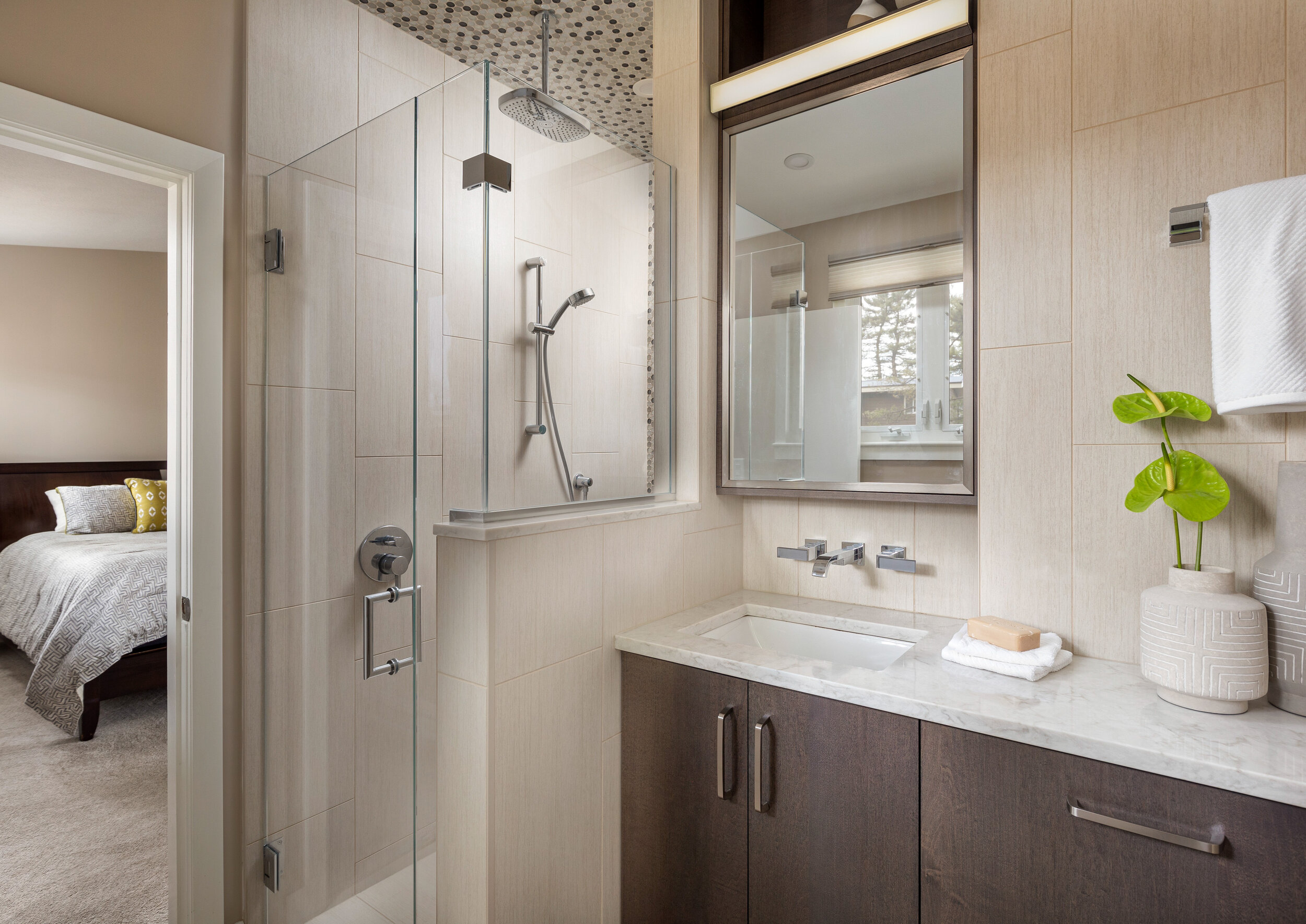
To accommodate the new master bedroom closet, space was “borrowed” from an adjacent bedroom. The linen closet in the master bathroom was removed to make way for an enlarged shower, new vanity and toilet in a new position.
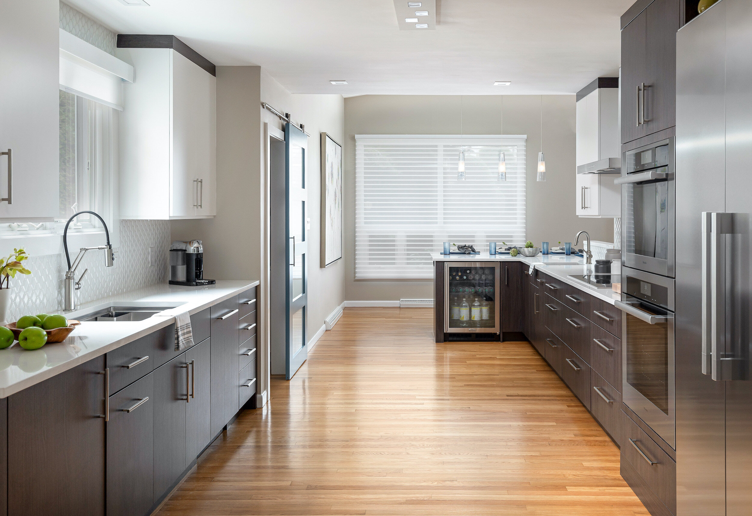
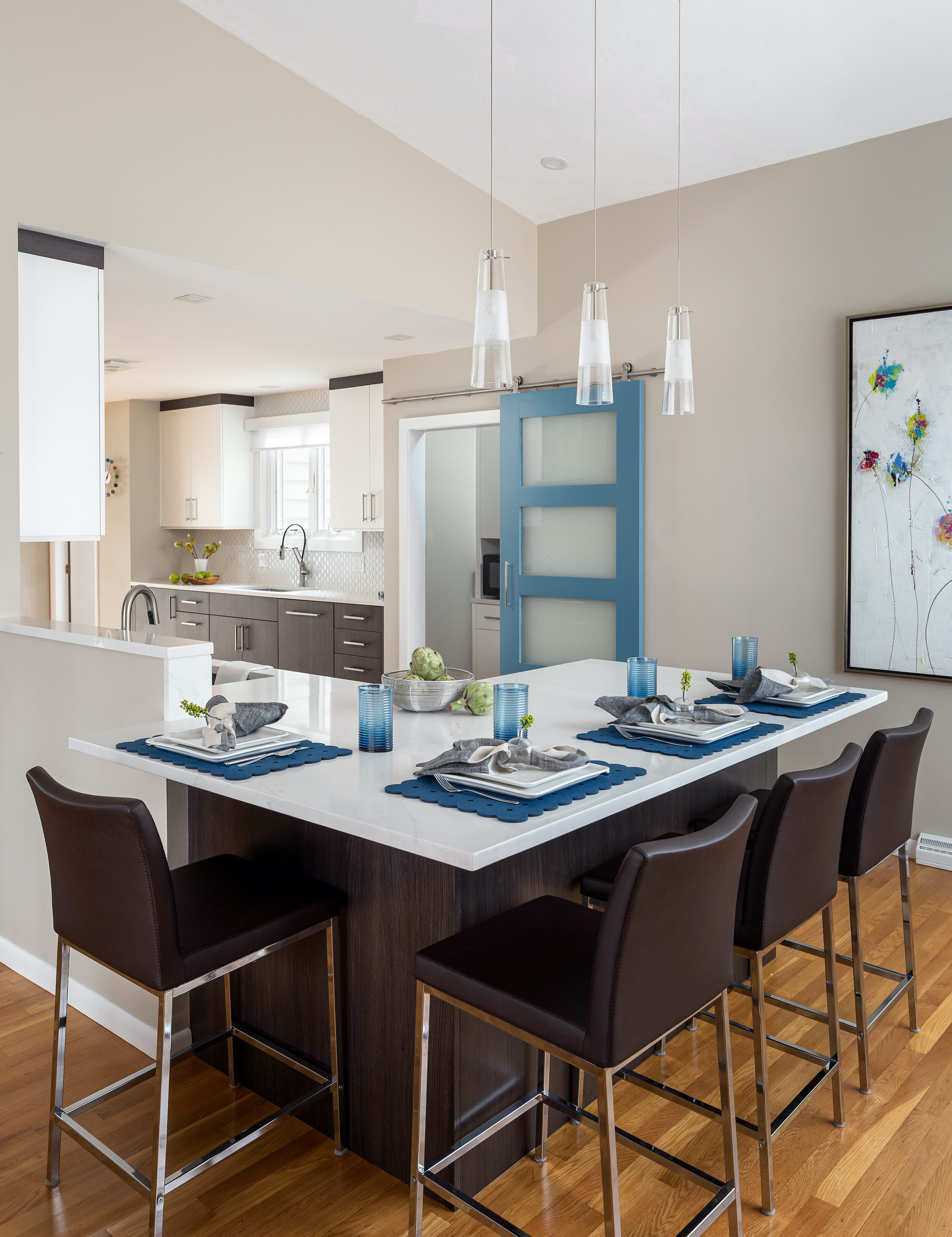
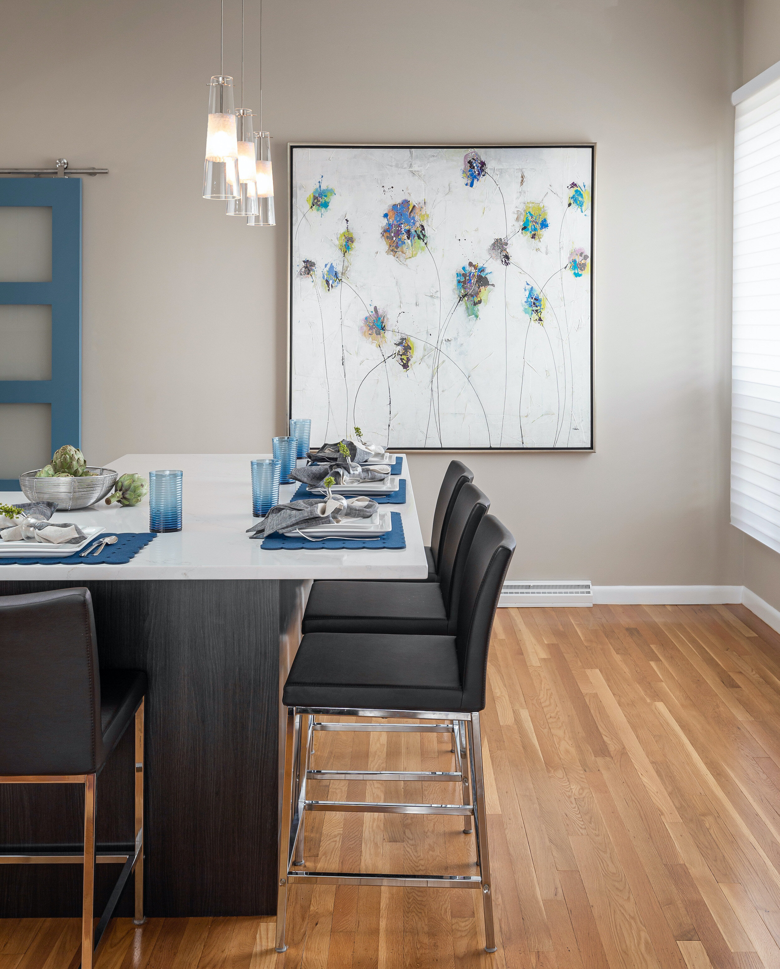
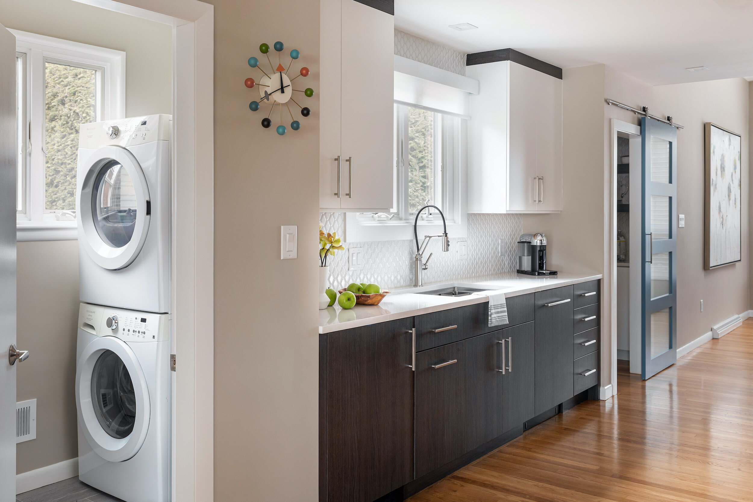
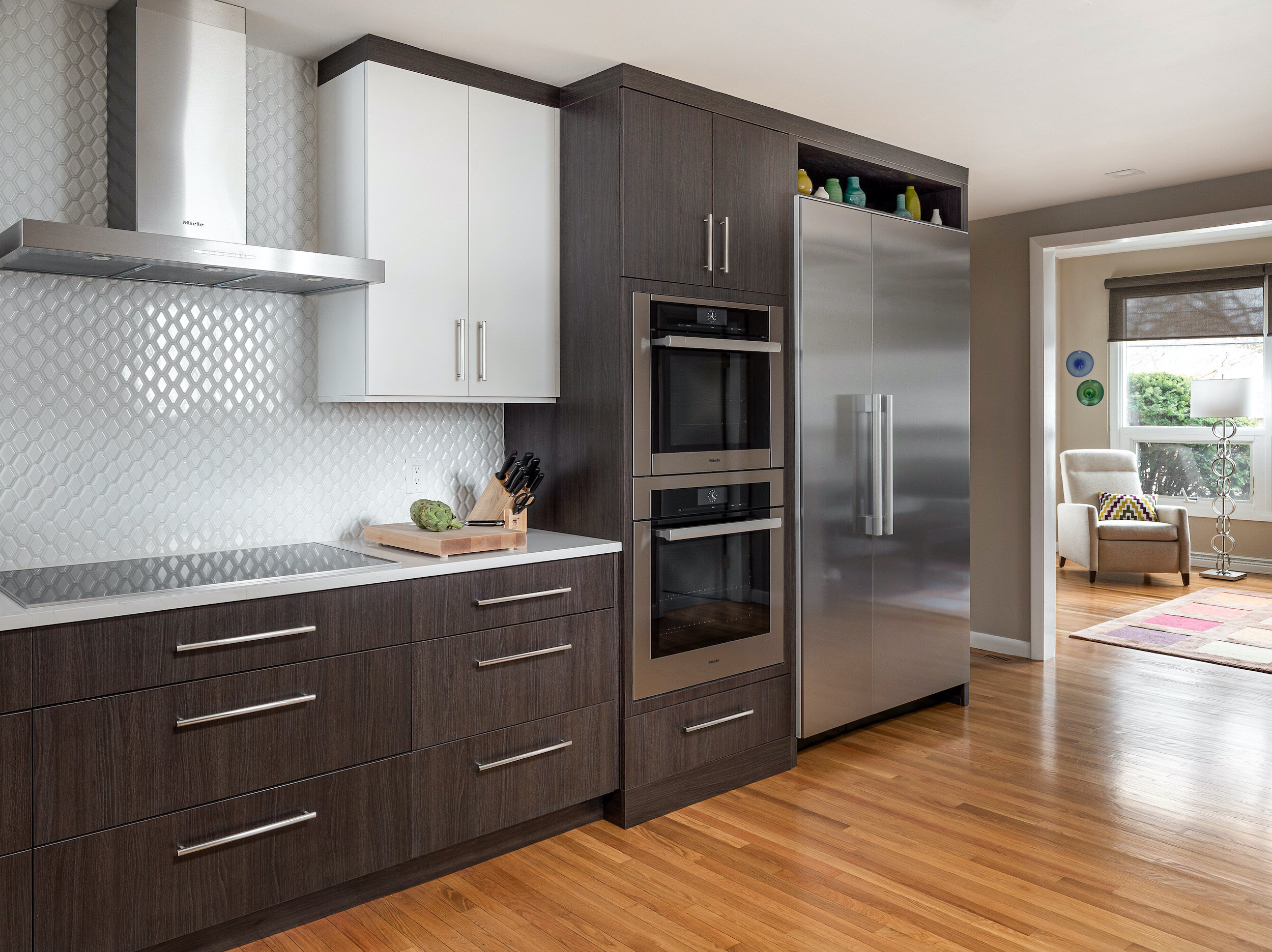
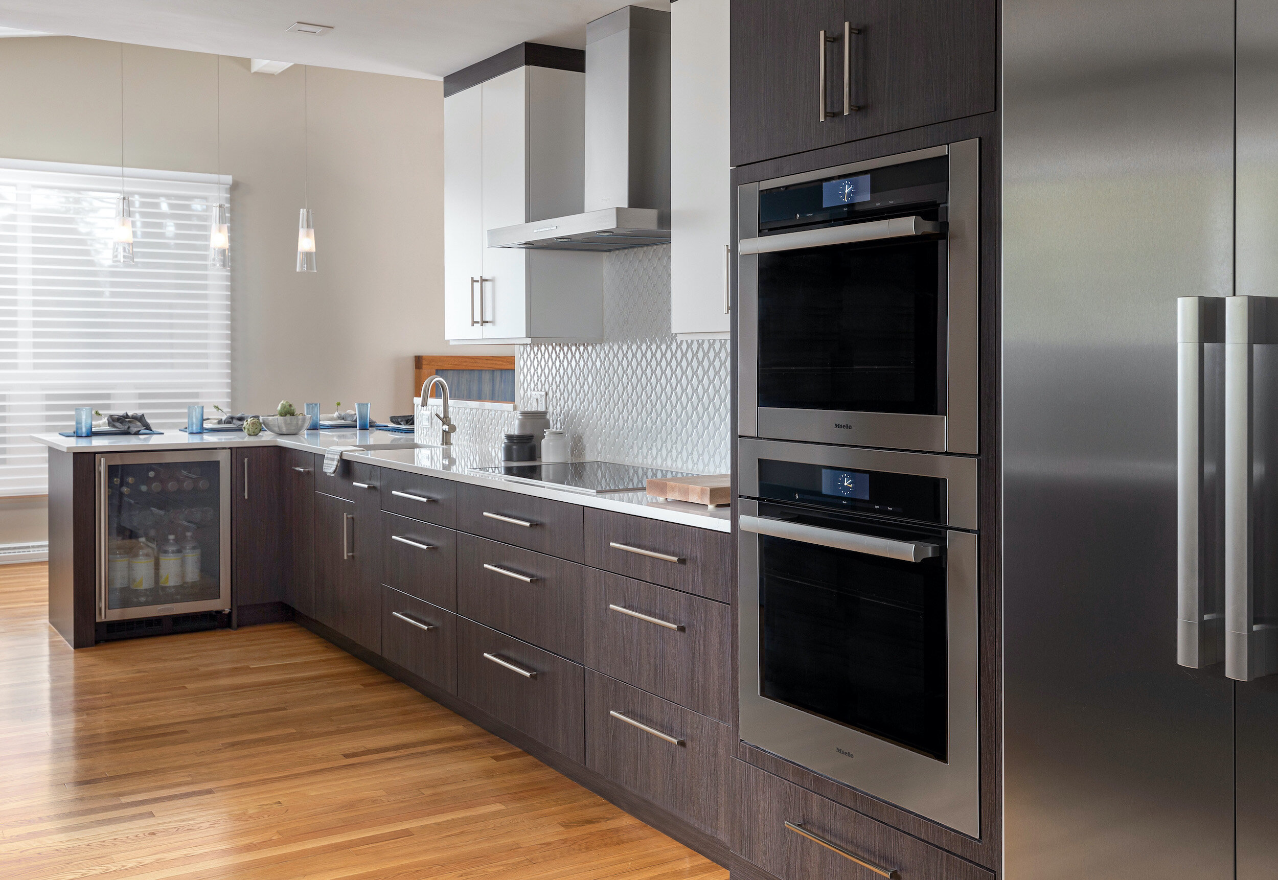
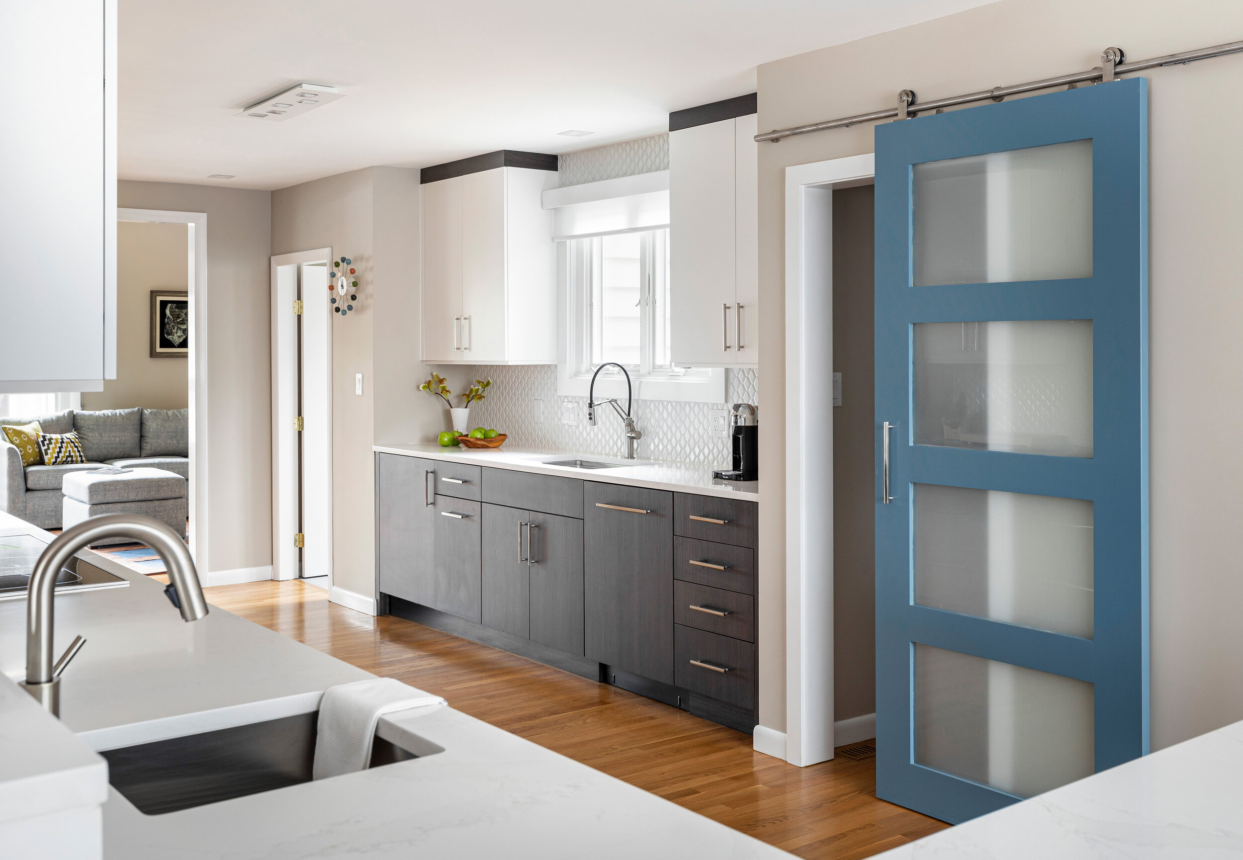

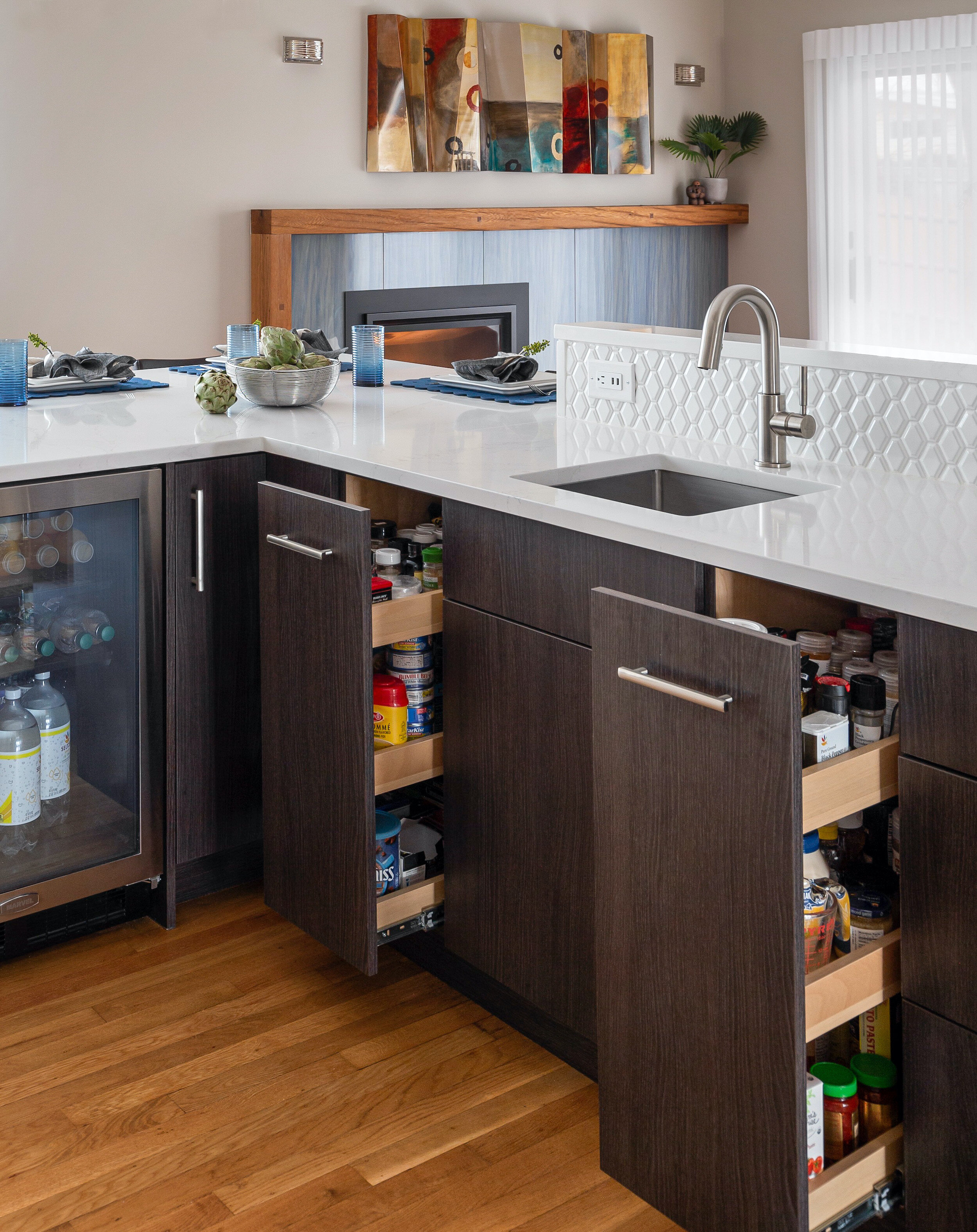
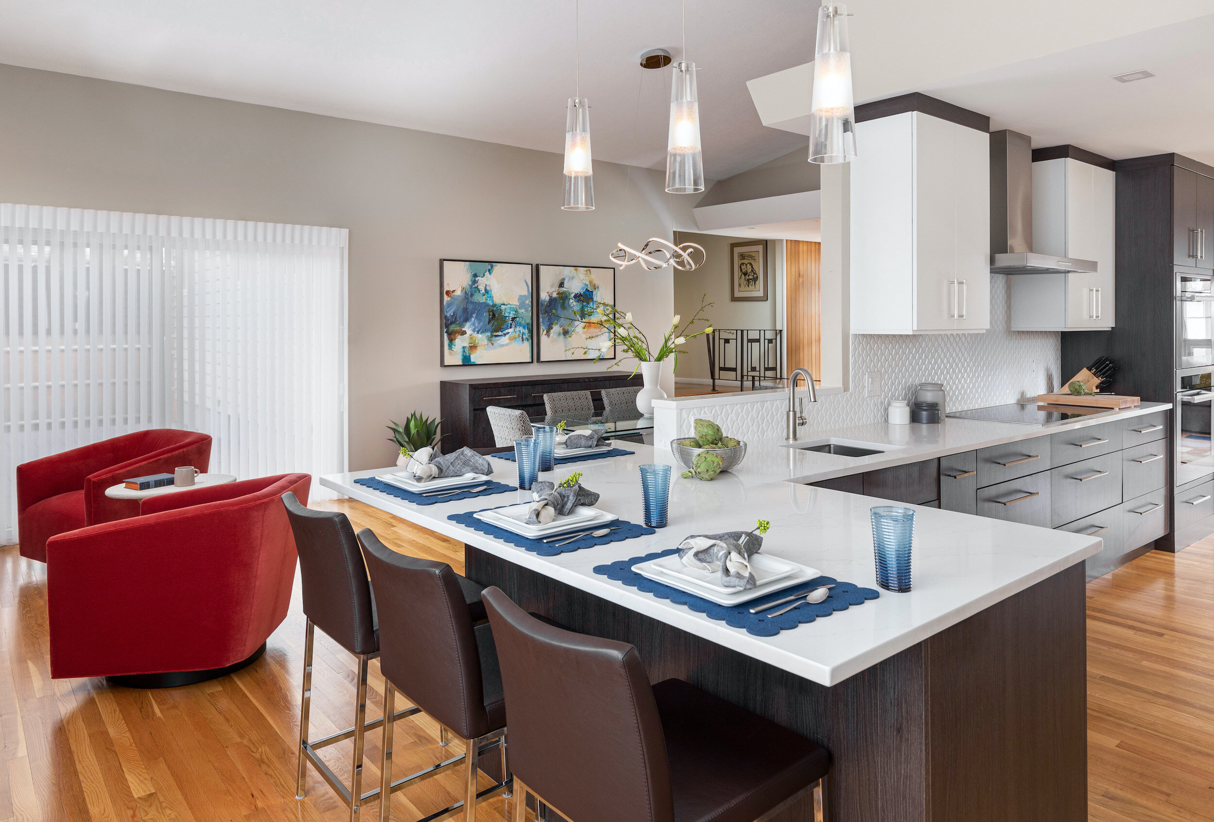
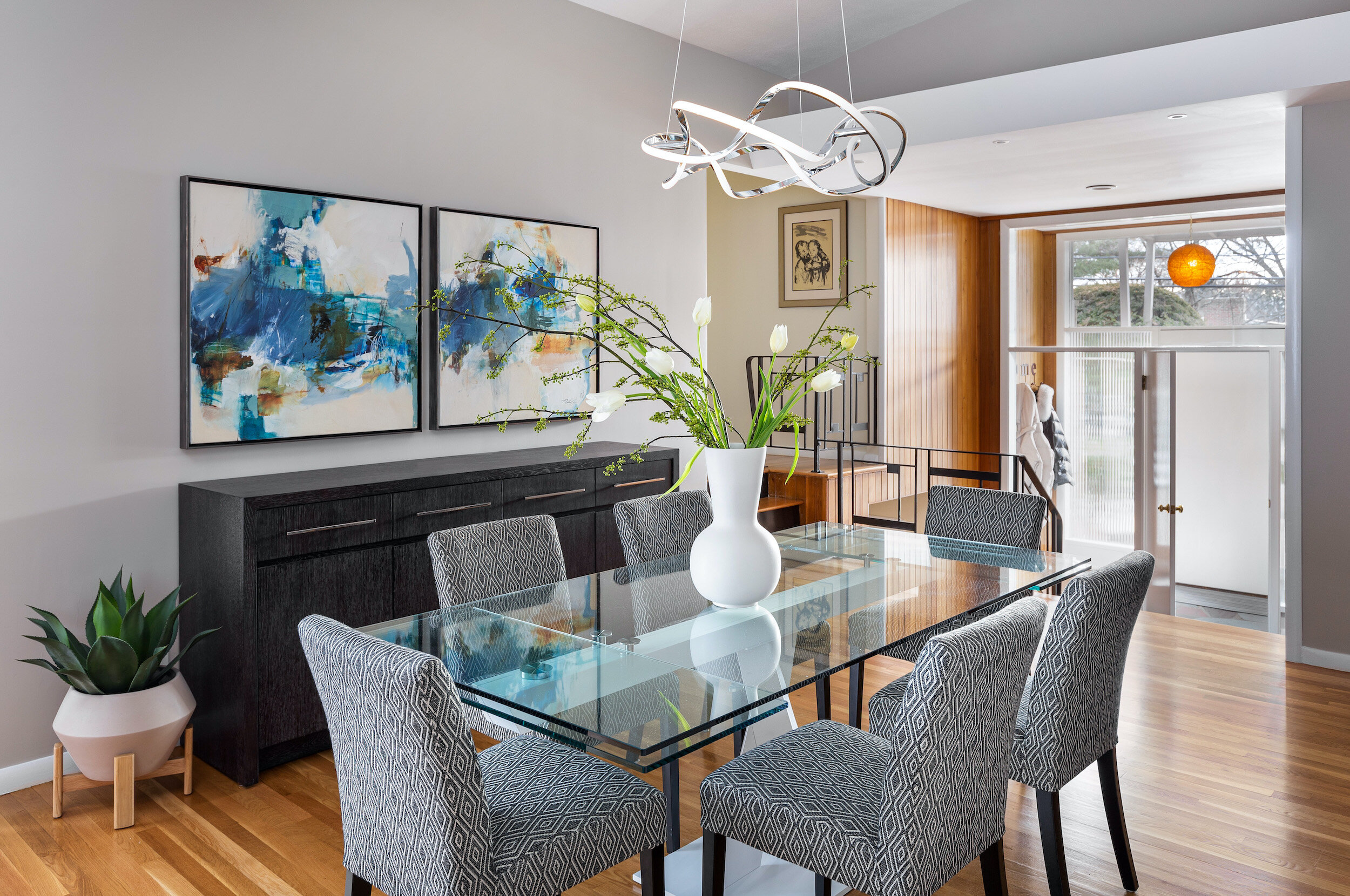
The kitchen feels wider and larger with the expansive peninsula and the absence of the stand-alone table and chairs. Zones for prep, cooking, and clean-up are better designed with the appliances along one wall, and a sink, dishwasher, and undermount freezer on the other. A second sink allows for more than one function at a time.
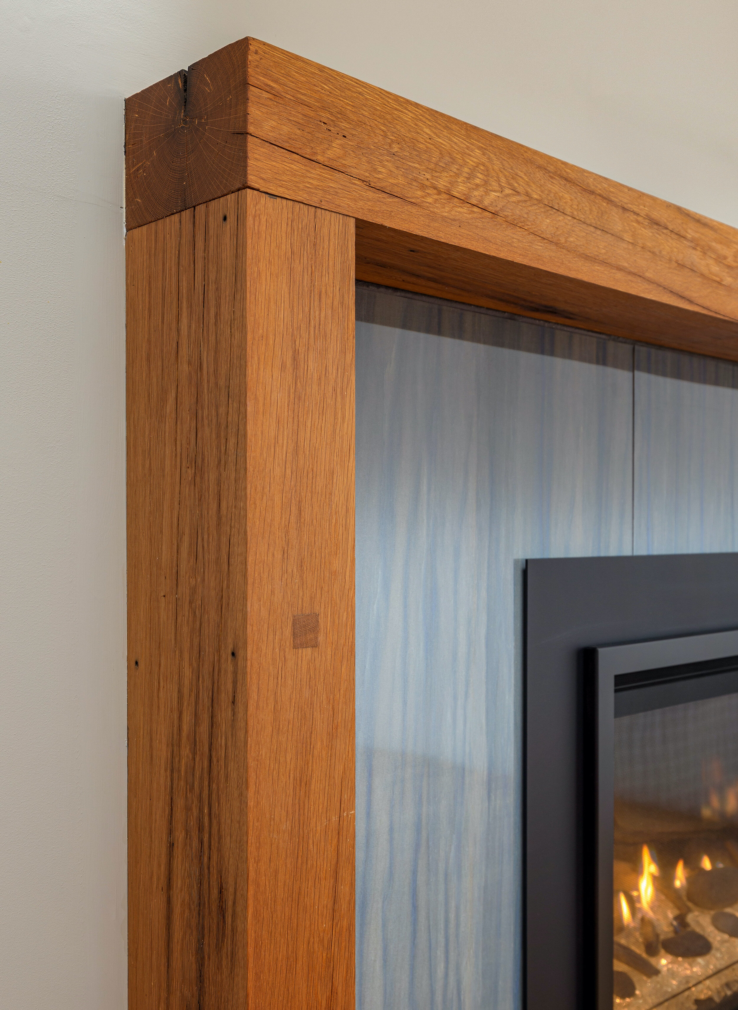
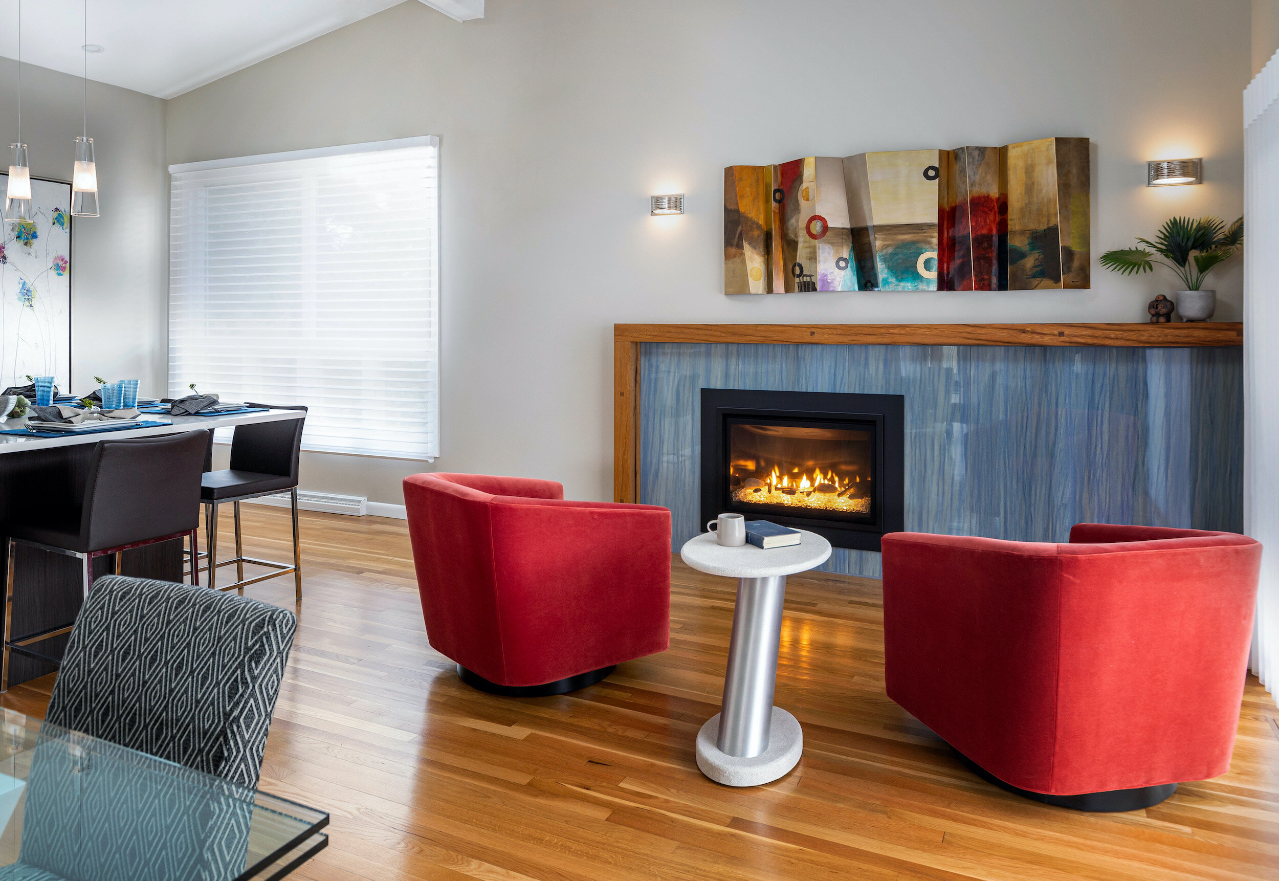
We removed the paneling and gave the fireplace a beautiful treatment with a blue porcelain surround and a reclaimed wood mantel. A cozy seating vignette in front of the fireplace, new cove lighting, and the sliders to a new deck make the space inviting and functional.
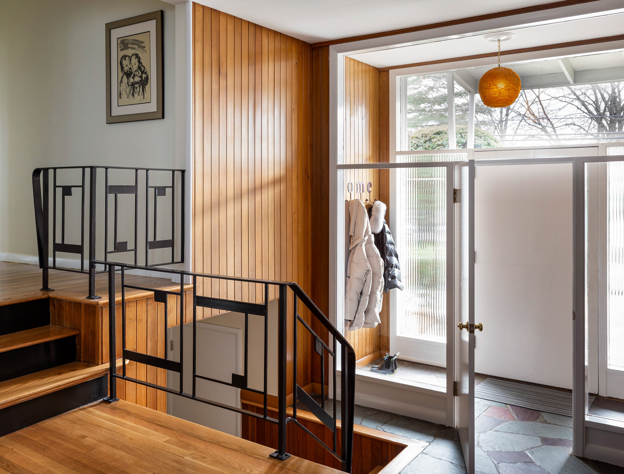
The family room received a facelift as well. Paneling was removed and walls and ceiling smoothed and painted. The original iron railings leading to the upstairs were painted black, new lighting fixtures and paint provide the finishing touches on this project.
The changes to the bedrooms seem as though they had been in the house all along. The space “borrowed” from the room adjacent to the master bedroom makes a big difference for the master. Separate closets for the husband and wife was one improvement. The updated master bathroom has a beautiful walk-in shower with a built-in bench and a new vanity.
Conclusion
We collaborated with Nate Dishington of Jensen Hus for the construction of this project. Keeping the open floor plan intact while enhancing the overall functionality of the kitchen and adjacent spaces resulted in very happy clients. Expanding the footprint of the master bedroom and renovating the master bath, gave the family the additional luxury and privacy they sought. In many cases, this house would be a tear-down, but being able to renovate the kitchen and provide space for professional appliances, a walk-in pantry, and improved circulation and lighting, we saved this home from the fate of many others in similar neighborhoods. This mid-century house has been modernized for 21st century living.
Our Client’s Words
“We used KitchenVisions for a completely gutted remodel of our kitchen, master suite, den, living room, and more. Jodi and her team provided an excellent collaborative experience that included multiple visits, beautiful design renderings, and as many meetings as we needed. In addition she helped us to select and work with a great contractor. KitchenVisions fees are a tremendous value for what you get, which is a true partner with uncanny professional judgment and execution in designing and building the best possible space.
Jodi and team are very organized and come prepared for each meeting to maximize everyone’s time. She did a great job narrowing down decision points without pushing in one director or another, but rather by asking questions about what experience we wanted from each space. She will also steer you away from really bad design ideas you see in DIY kitchens. In all, we cannot recommend KitchenVisions strongly enough, and will definitely use them in the future for new projects.”


